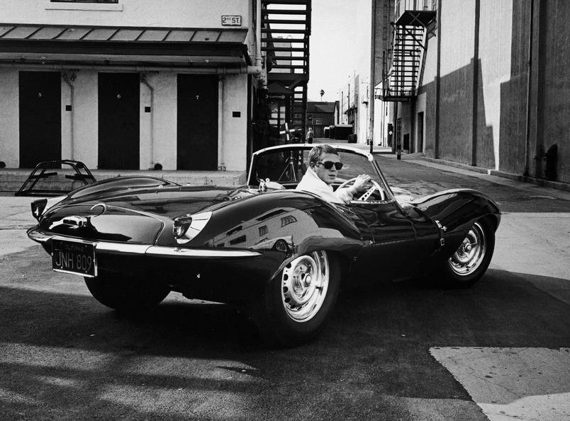
Category Archives: History

Horological Mythology: The Osmosis of Cool

In the world of watch collecting, one gets used to heady price tags and watching the those prices rise over the years. It’s logical, despite occasional anomalies like market corrections and bubbles, that desirable things go up in value over time. It equally adds up that in a time when wealth is more concentrated than it has been in decades, those who can afford to pay a lot for something can usually afford to pay a WHOLE LOT for something, and so dealers adjust their prices accordingly, and the rest of us have to pay up to keep up. C’est la vie.

But what in the world accounts for something like the $17.75 million we saw shelled out for Paul Newman’s own Rolex “Paul Newman” ref. 6239 Daytona at auction last week? The most paid for any watch ever. Theories abound, of course. The fact that a normal Rolex “Paul Newman” ref. 6239 Daytona is a somewhat rare and desirable watch in it’s own right is a good starting point. Add to that the sweet story about his wife gifting it to him, and Mr. Newman’s owning and wearing this particular watch throughout an exciting portion of his life (regularly racing cars and frequently seen in public generally being cooler and better looking than the rest of us), thus leading collectors in the 80’s to name the reference the “Paul Newman” in his honour, and we have a pretty solid explanation as to why this watch would be worth more than the “normal” Paul Newman. But a normal “Paul Newman” Daytona goes for about $200,000, so is the one that started it all really worth that much more, solely as an originator of a sect of the watch collecting world? I say no.

Continue reading

CYNTL (Cars You Need To Love!)- Episode 1: The Ferrari Mondial

It’s been a while since I’ve chimed in at MFL. Work obligations got the better of me, but now I’m back and I’d finally like to put forth the first installment on a series of underrated cars –  magnificent machines that won’t (necessarily) break the bank, and hold their own with the best in terms of style, performance, or at least my opinion. The idea with this series is to put forward vehicles that are often overlooked for any variety of reasons, be it ubiquity, long held prejudice, or just generally passed over for one reason or another, but are actually some truly great cars. It’s called Cars You Need To Love. For the first installment I’ve chosen my personal favourite in the category of wrongly maligned and ignored autos. So without further ado, allow me to (re)present….

The Ferrari Mondial

ferrari-mondial-08

History

The Ferrari Mondial was introduced as a coupe in 1980, replacing the “Dino” 308GT/4 as the new 2+2 GT car in the line-up. The GT/4, a truly great car in it’s own right, was a bit of an odd bird for Ferrari. It was one of two Ferrari’s, along with the 206/246 GT series, that didn’t technically start out as Ferrari’s. They were built under the Dino marquee as more affordable, user friendly machines to broaden Ferrari’s consumer base throughout the late 60’s and 70’s. When the 246 series ceased production in 1974, the 4 seater 308 GT/4 was the sole “Dino” left on the market. But that didn’t last long. By 1976, the 308GT/4 had been re-branded as a Ferrari. Turns out that consumers all knew they were buying a Ferrari, and that was part of the issue. The cars were made by Ferrari and the engines said Ferrari, so it seems consumers felt the badges on the car should say Ferrari as well, and that anything less was a bit of a disappointment. Sales reflected that thinking, at least in the USA. I know Dino owners who’ve spent many hours over the years explaining to everyone from first dates to fellow car nuts that their Dino’s were in fact Ferrari’s (now an accepted fact). Additionally, the 308 GT/4 was a blip in Ferrari’s more or less strict allegiance to design house Pininfarina, with the job of the GT/4 having been given to competing house Bertone. Bertone delivered a wedge shaped car totally devoid of the rolling elegant curves that typified Pininfarina’s designs, and that also had Ferrari fans squawking at the time. When the time came for a successor to the 308 GT/4, the job went to Pininfarina.

ferrari-dino-308-gt4-c319608022016111645_1
A young man checking out a Dino 308 GT/4 in the 70’s ^

So it was that the Mondial appeared in 1980. The reaction was, to say the least, mixed. Pininfarina delivered a car that had some of the curves restored, but not all. The car lacked the arched roof and fenders of other Ferrari’s of the time. It also integrated the “cheese grater” air intake scoops on the side of the car, which were very 80’s to say the least. Additionally, being a mid-engined 4 seater, the car was elongated on the rear end, or perhaps shorter on the front end, creating an odd sense of proportional aesthetics that divided opinion. But in truth, all Ferrari’s with 4 seats have an uphill battle to climb. It seems to be the general consensus that Ferrari’s are NOT meant to be family friendly cars, but rather lean and mean 2 seaters that look sexy and go fast. At the time, Ferrari was offering the 308 GTB or GTS and the Berlinetta Boxer, two cars that certainly felt like they fell into that camp, as well as the stately 400i, a powerful but decidedly plush gentleman’s V12 2+2 touring car. The Mondial sort of fell in between the two camps, and people weren’t sure how to respond to it. Do we treat it as a really sporty GT or a sports car with a backseat? To further muddy the waters, some of the magazines got “not quite ready for prime time” cars to test drive. This resulted in some unflattering reviews that have stuck with the Mondial to this day. That’s a fair amount of baggage, so let’s unpack it…


Continue reading

The Gilt-Gloss 5512 Submariner– a Review by Beaumont Miller II

Introduction

The 1950s to the mid 1960s was a golden era for Rolex. Watches produced by the company during this time have captivated the hearts and minds of Rolex collectors for many years. The passion that drives many watch collectors is the desire to find not just older watches, but to search for vintage watches whose dials have been well preserved and protected from the elements and at the same time, have aged in a way that each has taken on a unique patina. Thanks to the introduction by Rolex of it’s patented Oyster case with its improved screw down case back and winding crown, many of these dials have survived today giving collectors much to be happy about.

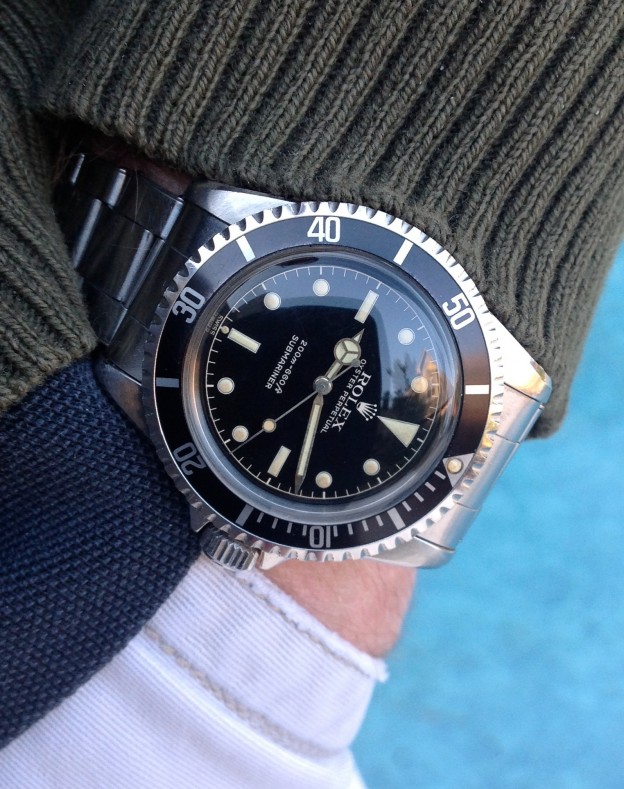
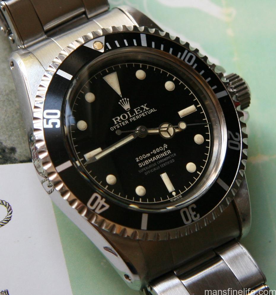
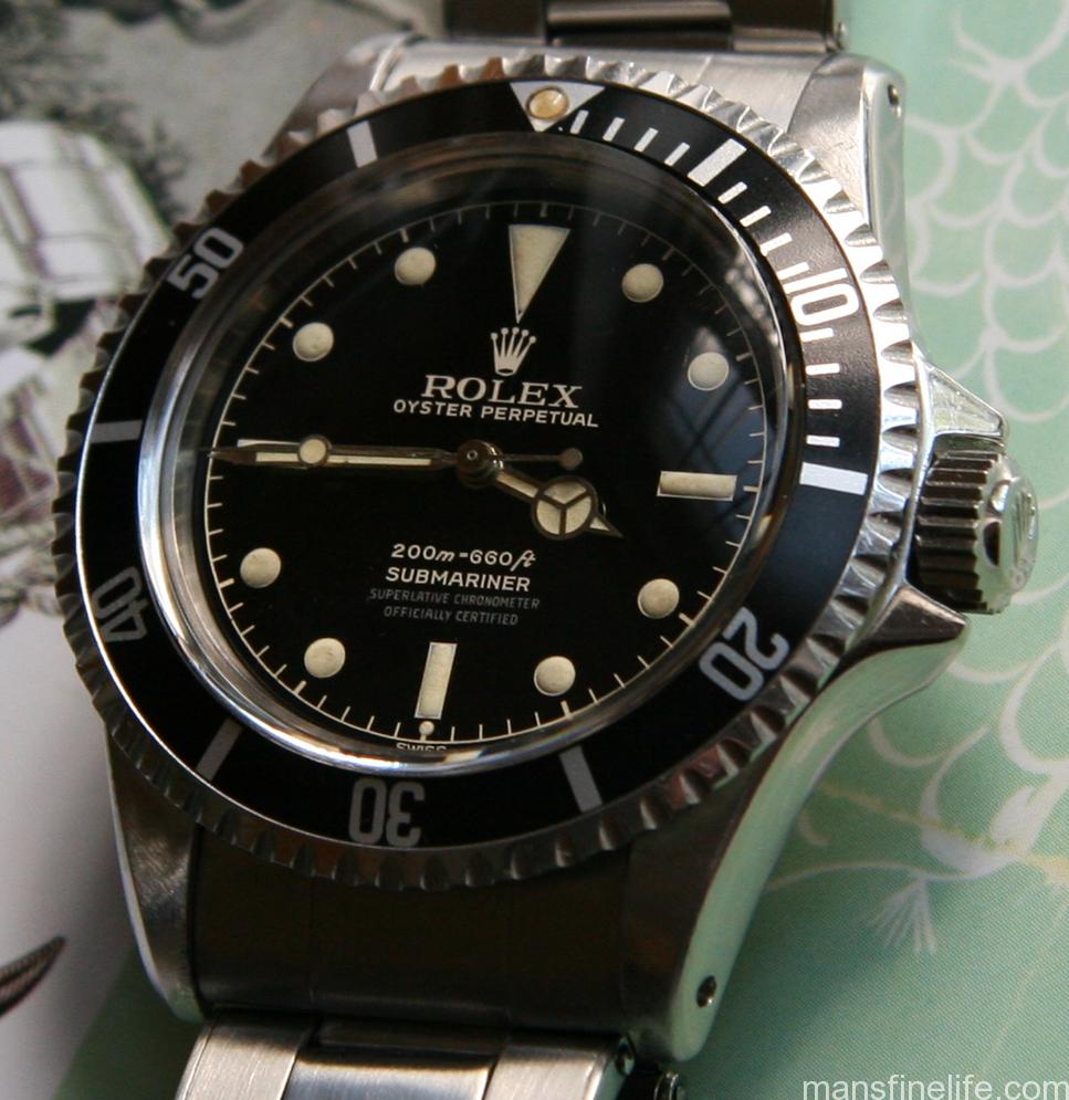
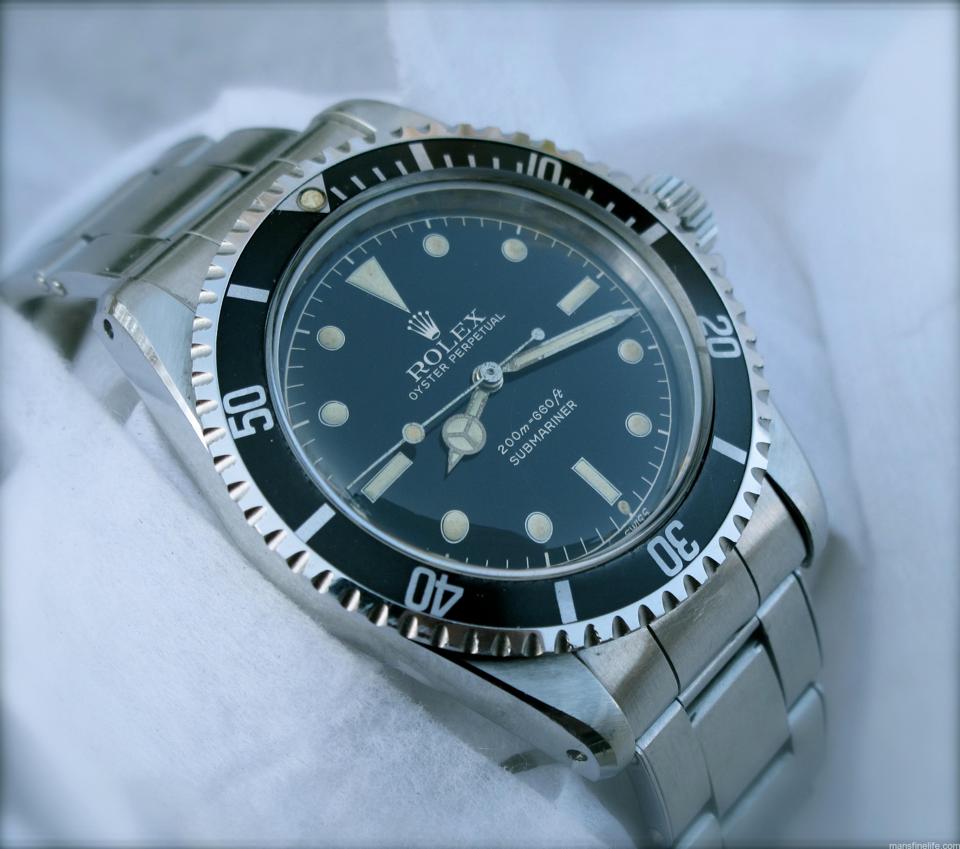
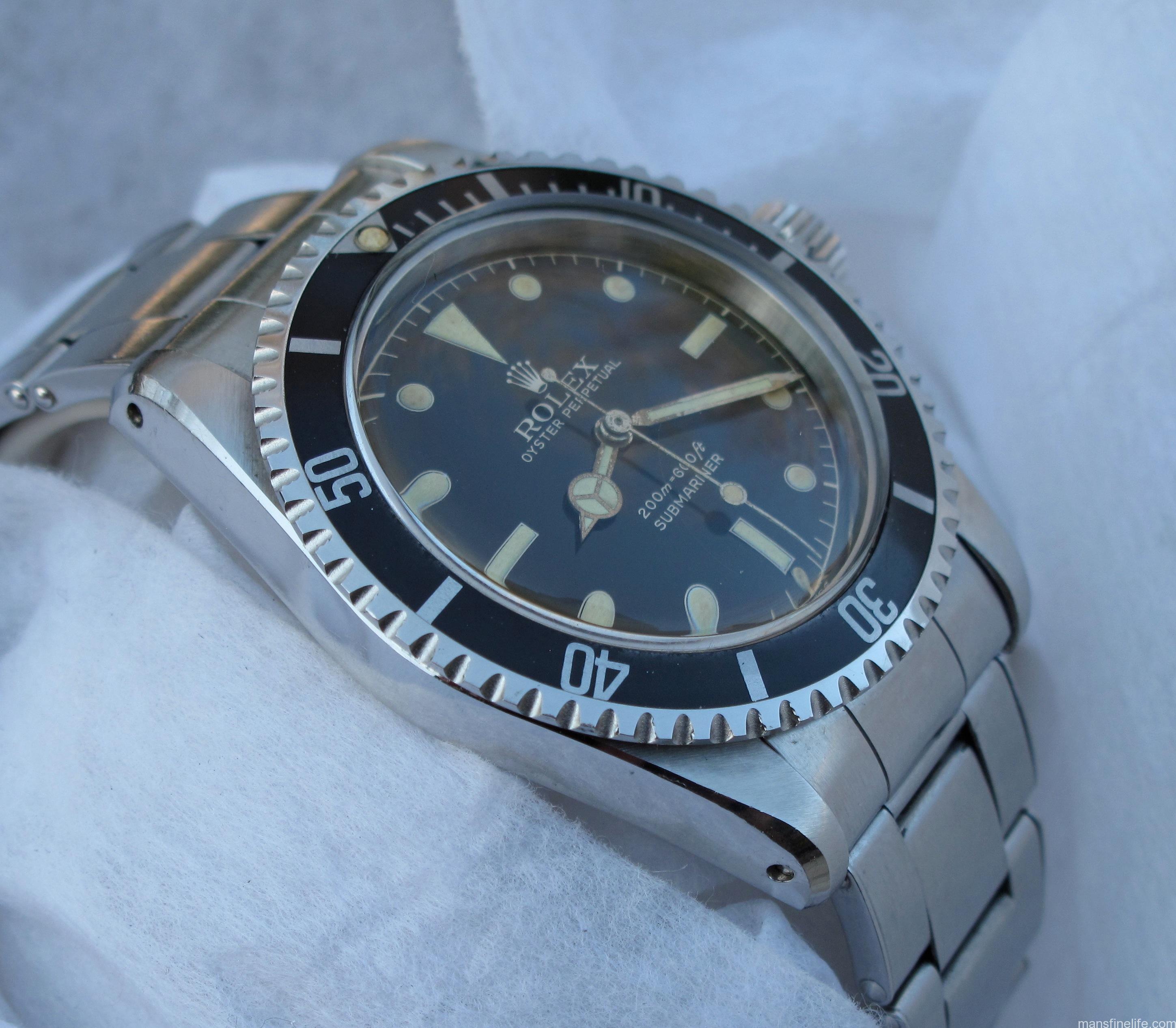
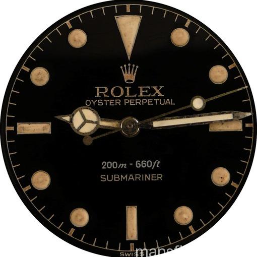
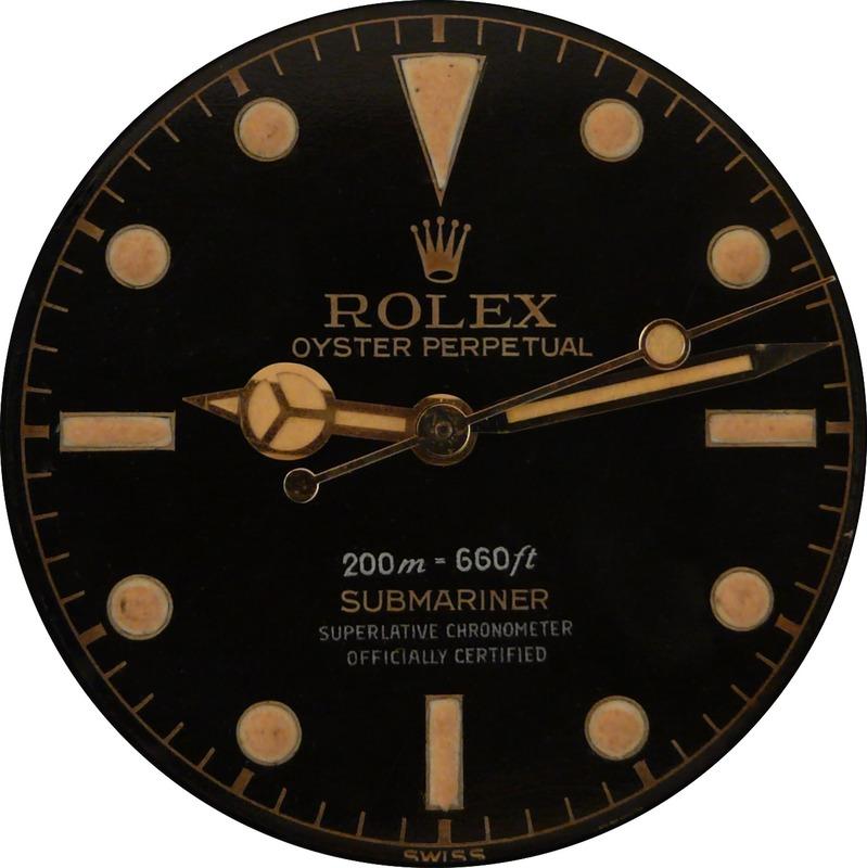
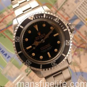
The dials produced for the Rolex Submariner and GMT during this time are known by collectors as gilt-gloss or gilt/gloss dials.  The term gilt, as applied to these early Rolex dials, refers to both the gold tone of the text as well as other features of the dial.  While many collectors may not feel that the term gilt is appropriate when used in this context, it has stood the test of time, and as any collector with a passion for Rolex dials can tell you, it is a far better description than the names given to identify some other dials. The term gloss describes the mirror like black glossy surface of these dials, which is in contrast to the matte finish which was introduced by dial manufacturers for Rolex watches in the mid 1960s.

5512-61,4line-2  5512-61,4line-3

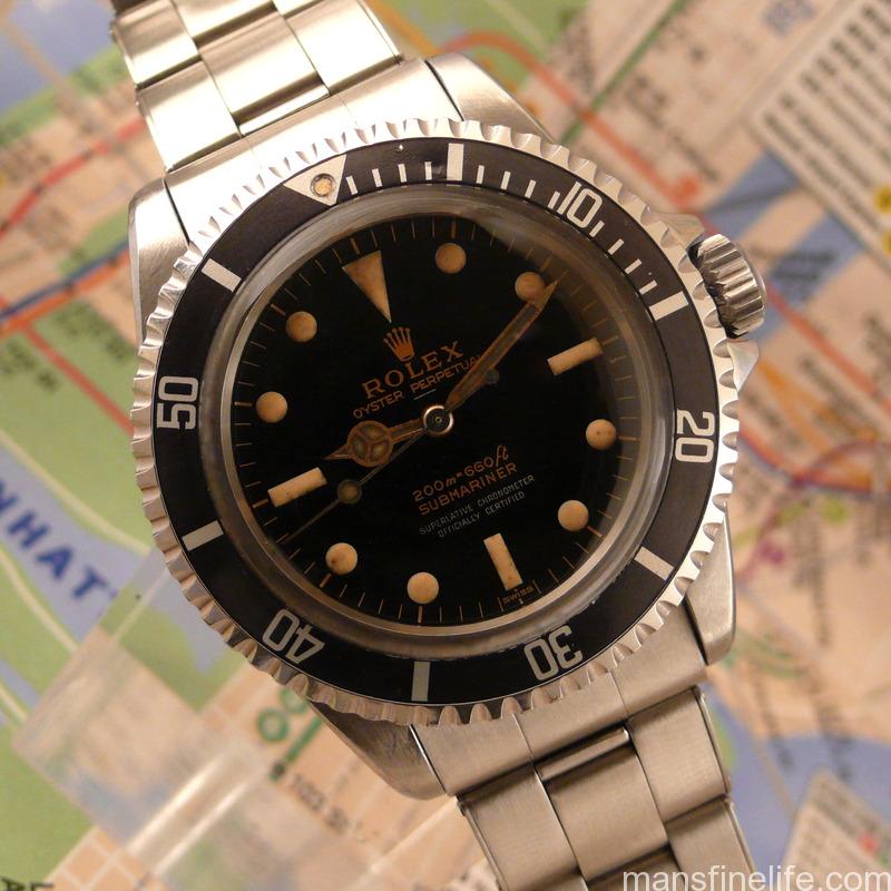
The manner in which these gilt-gloss dials were produced is very interesting. While some dial manufacturers might paint the text on the colored surface of the dial, those making the dials for the Rolex Submariner and the GMT did so in a way that the gold colored text and features are in relief or below the surface instead of on top. These gold aspects of the dial are actually the brass dial plate and lie underneath a coat of black glossy paint. On top of the black layer of paint, a clear coat of lacquer was then applied . In the case of the very early gilt-gloss dials, it was not uncommon to have lines of silver colored text in addition to the gold colored text. The silver colored text was applied on top of the final clear lacquer coat. Finally, the luminous material that allowed the watch to be read in the dark was applied. The more radioactive radium used for the dial and hands in the 1950s to make them glow was swapped for the less radioactive tritium in the early 1960s.

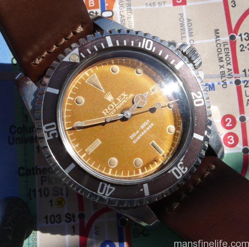
The way these dials have aged is at the heart of why these watches are so favored by vintage Rolex collectors. Just as no two fingerprints are the same, the same can be said of these early Rolex dials. It is not uncommon for the dials produced in the 1950s to have a darker more orange color to the text on the dial, while many others that were produced later tend to have acquired more lighter shades of gold tone. The difference between the two is likely due to the radium versus tritium used for the luminous material and how the brass dial plate reacted with the chemicals used to prevent corrosion during the manufacturing process. Another beautiful feature of these rare watches is the appearance of the glossy dial in different lighting conditions. The richness of the black high gloss finish of many dials can be readily seen in the sunlight, while other dials exhibit different shades of brown.

photo  photo

Another reason these early Rolex models are sought after by enthusiasts is because of the attractive styling of the watch case. As hobbies evolve and collectors become more knowledgeable, it’s common for the emphasis placed on certain aspects of the objects collected to change over time. Vintage watch collecting is no exception. Within the last five or six years, collectors have moved away from the mantra, “It’s all about the dial” and adopted a more progressive maxim, “A great watch starts with a great dial, but doesn’t end there”. Both the Rolex Submariner reference 5512 and its predecessor, the Submariner 6538, share the large chamfers or beveled edge on the lugs of the watch case that are prized by collectors. In recent years collectors have realized that unmolested examples with their sharp cases nearly intact are rare treasures.

photo   IMG_0109                                                                         

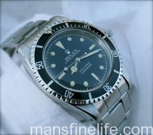
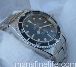
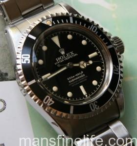
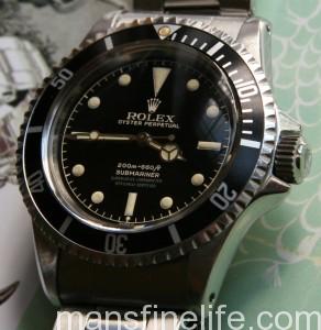
The Rolex Submariner reference 5512 was introduced in 1959 and was likely produced until 1980. Early examples were fitted with the calibre 1530 movement, and the improved chronometer rated 1560 movement was introduced a year or so later. The 5512 shared some of the styling features of the earlier Submariners like the outer rotating black bezel that helps to keep track of elapsed time. However, unlike the earlier Submariners, the watch case produced for the 5512 featured crown guards on either side of the winding crown, a feature that remains on the Submariner to this day. The many different gilt-gloss dials combined with the different shaped crown guards are some of the unique features of the 5512 that make this sporty and elegant reference a favorite of vintage Rolex collectors. Understanding the chronology and significance of these early dials is a passion of mine. From a collector’s perspective it is important to be able to evaluate a vintage watch based on its originality and period correctness. Unfortunately, not many collectors have the ability to locate vintage watches from original owners, and because the provenance of other watches is not always clear, understanding the significant changes in the evolution of this Submariner is critical in making sure that the watch has the correct movement and dial.

The following is a brief overview of the 5512 discussing some of the more common and rare gilt-gloss dials and their characteristics as well as a short summary of the different types of crown guards and movements from 1959 to 1966. There are few hard and concrete rules with Rolex during this period, and as such, this overview should NOT be seen as a conclusive authority to check the correctness of your vintage Rolex, but rather a guide to help collectors appreciate the many subtle nuances of the 5512 from the early to mid 60’s.

A warm thank you to Andrew Shear for allowing the pictures from his dial archive for this 5512 review.  Click on each pic for a higher resolution photo in a new window.  


1959-1960

photo-17  photo-18

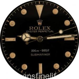
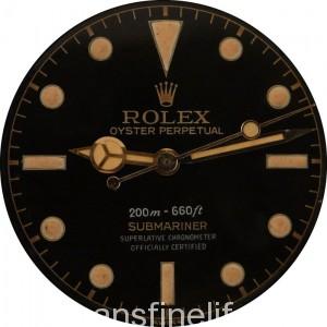
The earliest dials for the 5512 are often called MK1 dials and can be easily recognized by the shape of the coronet, typically with the last spike on the right extending a bit further down than the other four. The phrase “Old Font” dial, a term often used by Marcello Pisani, was an appropriate description based on the observation that the Mk1 coronet was reminiscent of some of the previous coronets seen on the “Big Crown” Submariners from the 1950s.

During this period there are two different types of dial configurations for the 5512. There is the 2 line version with only the depth rating and “SUBMARINER” printed below it and the 4 line version with

“SUPERLATIVE CHRONOMETER
“OFFICIALLY CERTIFIED”

aka SCOC text , printed below the depth rating and “SUBMARINER”.

The early 5512 Submariner dials have different combinations of silver and gold text ranging from one line of silver and one line gold to three lines of silver and one line gold. Continue reading

What We’re Wearing – Hats by Gary White aka “The Custom Hatter”

Over the last few years I’ve found it interesting that while men’s hats (hats – not ballcaps) have made a bit of a comeback, there are still very few people who make or wear really exceptional ones. There are a ton of cheap, stingy brimmed fedoras and trilby’s out there, but none of them are really any good. Most are made in the spirit of the fashion world, ie- disposable 10 minutes from now, and cost way too  much for what they are. This is in pretty stark contrast to men’s suits, where there are now many really good tailors making some pretty fantastic clothes. But hats, alas, remain a comparative wasteland. But in the midst of the tumbleweeds, one man in New York State is making really exceptional custom made hats on a daily basis. That man is Gary White.
3pthomburg side
Above: Hat by Gary White in “dark moss” beaver felt with 3 point diamond crown with a Homburg roll on the brim. Side view.


Mr. White runs “The Custom Hatter” from a small studio in Buffalo, NY. His shop is packed with tools of his trade that reach back 100 years or more. He has sought out and acquired vintage and antique wooden forms and machinery that allow him to create any authentic hat shape or style that you could dream up or find. I appreciate his work for two reasons. The first is his adherence to tradition and not falling into line with easy fads. The second is the craftsmanship and quality of the hats themselves. They’re made from very high quality felts pressed from one or more furs. The hat making process itself is carried out by Mr. White to the customers specific desires, although he offers guidance and advice if wanted.  Using a rare old machine he blocks (shapes) the hat before going on to finish the crown shape with the correct form to match the customers desires, selected from a huge collection that Mr. White has acquired over the years. The final steps involve shaping and finishing the brim before hand sewing in the lining and putting on the ribbon. Basically Mr. White is providing the equivalent of Savile Row tailoring skills for the hat making industry. You can see an overview of his hat making process here.


GW hats Boardwalk Empire

“Nucky” & “Jimmy” wearing hats by Gary White.

Continue reading

Classic Movie Watch — Patton (1970)

Among the greatest of war movies, 1970’s Patton features a mind-blowingly good performance by George C. Scott as the famously colorful WWII general that serves to catapult this epic far above the standard military biopic. The film is not only remarkable for the vivid on-screen portrait of a gifted but notoriously impolitic and ambitious American general helping to turn the tide of war in the United States’ favor but also for the off-screen context of being made at the height of rampant anti-war sentiment in the US and abroad due to the Vietnam War. You would have expected the film to be a hatchet job on an unrepentant warrior from the gung ho past and to reflect the anti-authoritarian zeitgeist of the time. You would also have expected a war-weary public to reject yet another nostalgic World War II movie released at the end of the 60s. Instead, it’s a straightforward yet nuanced portrayal of a seriously flawed but undoubtedly great military leader that earned popular and critical success from the get go with an unapologetically pro-US message. And through the movie we come to see that a man like Patton, a true lover of war who believed himself reincarnated from Roman Legionnaires and Napoleon’s soldiers, should probably be kept in a glass case that says “Break Open in Time of War”. But we also see that it’s surely good to have old soldiers like George S. Patton handy when the stuff hits the fan.

The famous opening sequence, a stylized and also sanitized version of Patton’s famously profane speech to the Third Army, remains one of the movies’ best “grabbers”, as well as one of the most iconic 6 minutes in the history of cinema. And despite Scott’s misgivings that starting with the speech would overwhelm subsequent scenes, that acts as a preamble and the movie gets better from there. It really starts with Patton’s arrival in North Africa to take command of a green and badly demoralized US II Corps after their mauling by Rommel’s Afrika Korps at Kasserine Pass, quickly whipping them into a cohesive fighting unit ready to take on the seasoned and highly accomplished German troops. By utilizing Rommel’s own tank tactics against him, we see the revitalized Americans fight back via impressive large scale armored tank battles thundering from the oversized 65mm widescreen print.


Continue reading

Notable passings — Walter R. Walsh

Introducing a new feature here on MFL to celebrate some truly amazing men who may not be “famous” in the general sense of that word but who have made a significant impact on the world at the time of their passing. These are men whose exploits, adventures and expertise we can admire and possibly even emulate but never duplicate. In short, they embody the very definition of a life well lived and we salute them and honor their accomplishments. Their like won’t come again and it’s important that we recognize and celebrate their deeds.

From The New York Times, the story of one of the baddest good guys you could ever hope to meet and a marksman nonpareil:


 (Courtesy of American Rifleman Magazine)

Walter R. Walsh, a world-class marksman who shot clothespins off laundry lines as a boy and went on to become an F.B.I. legend in shootouts with gangsters in the 1930s, an Olympic competitor and a trainer of generations of Marine Corps sharpshooters, died on Tuesday at his home in Arlington, Va. He was 106.

His son Walter confirmed the death.

Mr. Walsh was still winning handgun awards and coaching Olympic marksmen at 90, and aside from some hearing and memory loss, he was fit and continued to live alone at home. At the centennial of the Federal Bureau of Investigation in 2008, he was recognized not only as the oldest living former agent, but also as older than the organization itself by more than a year.

He joined the F.B.I. in 1934, a short, feisty James Cagney tough guy fresh out of Rutgers Law School. A natural left-hander, he was already a dead shot who could cut the center of a bull’s-eye at 75 yards with a rifle and blaze away at moving targets with a pistol in each hand — an enormous advantage in a bureau that was just breaking in its first class of agents authorized to carry guns. Continue reading

Art Notebook – The Wilton Diptych

For a while now, I’ve been meaning to write a bit about specific artworks and artists I think highly of, and I thought I’d start this new series with my favourite artwork of all time, The Wilton Diptych. Only about 21 inches x 14.5 inches in size when opened for display, but radiant well beyond its size, the work is actually a folding “portable” altarpiece comprising 4 paintings in total. The two paintings on the inside make up one continuous picture (the “diptych” referred to in its title), while the final two paintings serve as decoration for the front and back “covers” of the work. Most likely painted at the end of the 14th century (circa 1395-1399), the work was created for King Richard II of England around the time he was about 11 years old.
Done in gold leaf and tempera on two oak panels, the diptych is an stellar example of pretty much every aspect of art-making. The draftsmanship, brushwork, craftwork with the gold, and execution of detail are all mind blowing. The inside panels depict a young King Richard being presented to The Virgin Mary and Child, surrounded by angels. On the left we see Richard kneeling, surrounded by his presenters John the Baptist, Edward the Confessor, and Edmund the Martyr (I admit I had to look him up). On the right hand side, we see the Virgin holding the Child in her hands as he appears to reach out to Richard, the two of them surrounded by angels. The outside panels show coats of Arms on one side, and a white hart (stag) on the other. This last panel is my personal favourite, The white stag (Richards symbol) sits on a field of black grass. He wears a collar of gold (actually just an unpainted negative space) that blends into the gold leaf background, as do the delicately painted horns on his head. After seeing every major museum in the world, this panel is still hands down my favourite.
Wilton_diptych2
When I first saw the Wilton Diptych, medieval art and religious art weren’t my default favourites, and I think that’s what really got me about this piece. Like all masterpieces, it’s so beautiful that it transcends any intent or ideology that went into making it, and even its own physical nature as an object, and becomes a completely self-defining thing. A sum much greater than the whole of its parts.
Another kind of cool thing about the Wilton Diptych is that nobody knows who painted it. People sometimes attribute it to “The Wilton Master”, but no one knows who that is. Based on it’s stylistic characteristics, it’s generally thought the artist was French, and that he perhaps had experience working with illuminated manuscripts, due to the intricacy of the detail and the gold work. Some people are also confused by the name, which has nothing to do with Richard the II. The Wilton Diptych gets it’s name from the Wilton House in Wiltshire (home to the Earls of Pembroke for centuries), where it spent a large portion of it’s life before being purchased by the National Gallery in 1929, but it’s history is much deeper than that. If you’d like to read about the panel in great detail, the best place to find all of the info is actually here on Wikipedia. And of course, you can still find this tiny masterpiece sitting deep inside the National Gallery in London, waiting for you to come and check it out. It’s worth a trip to London just to see it in person.

MLK Day 2014

Because we’ve come so far as a nation and a people since 1963 but like all human endeavors we’ve still got work to do, it pays to listen again to one of the greatest oratories in our history and pay tribute to the man who made it.

MLK Day is always a good day to reflect on how to be a better person and how to make things better for others. Whether it’s a grand gesture or a simple one, it’s a fine day to make an effort on behalf of one’s fellow man.

Boxing Day

ali-frazier

If the above image is what pops into your head when you hear “Boxing Day”, then Frazier wasn’t the only one who missed! Of course if you happen to be American, you’ve got a pretty good excuse. In spirit, Boxing Day is one of the nicer and more charitable days of the year, but it’s sadly disregarded here in the US. The exact origin of the term is unclear, but there are several related versions. The one I grew up with is that Boxing Day was named for the day when people in service would receive their Christmas boxes as well as the day off from their employers (having been working for those employers on Christmas Day, no doubt.) A related definition is that Boxing Day is the time to give out Christmas boxes to tradespeople, having spent Christmas day with your family. There are other versions related to charity boxes set out to collect for the poor on St. Stephen’s Day (also Dec. 26th.) Today a vast number of countries celebrate Boxing Day, or a close variation, such as St. Stephen’s Day in Ireland, or Second Christmas Day in The Netherlands.

Whatever its origins, Boxing Day  has become a time to relax with family for one extra day after Christmas, prolonging the good cheer and encouraging an extra bit of relaxation before we all jump back into the fire. It’s a really nice sentiment that we all to often don’t see, giving a bit of extra time for family and friends to help us remember what counts most in life. So here’s to hoping that wherever you happen to be right now, you’re feeling warm and cozy whilst taking it easy with loved ones, courtesy of Boxing Day.


What We’re Listening To – “Don’t Ever Let Me Know” by The Bobby Fuller Four

The song of the day is “Don’t Ever Let Me Know”, by The Bobby Fuller Four. Bobby Fuller is one of the lesser known heroes of early American Rock & Roll, which is sad because he wrote a lot of really good songs in his all too short career, releasing 17 singles between 1961 and 1966. While many musicians were turning away from rock and into psychedelic music in the mid 60’s, Fuller stayed true to his roots, and no doubt would have gone on to release more great music, had he not died at the tender age of 23 under suspicious circumstances.

Continue reading