Tag Archives: Watch Info

tomvox1’s Watches for Sale — October selection

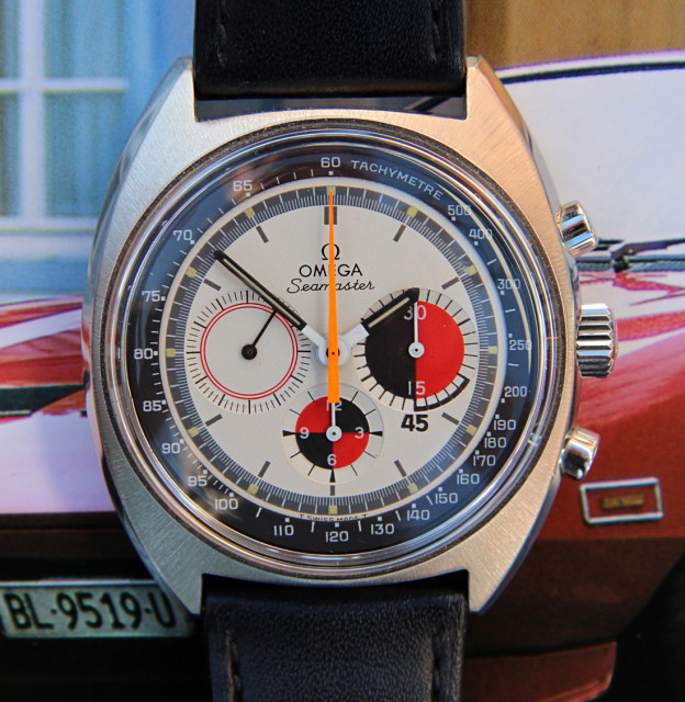
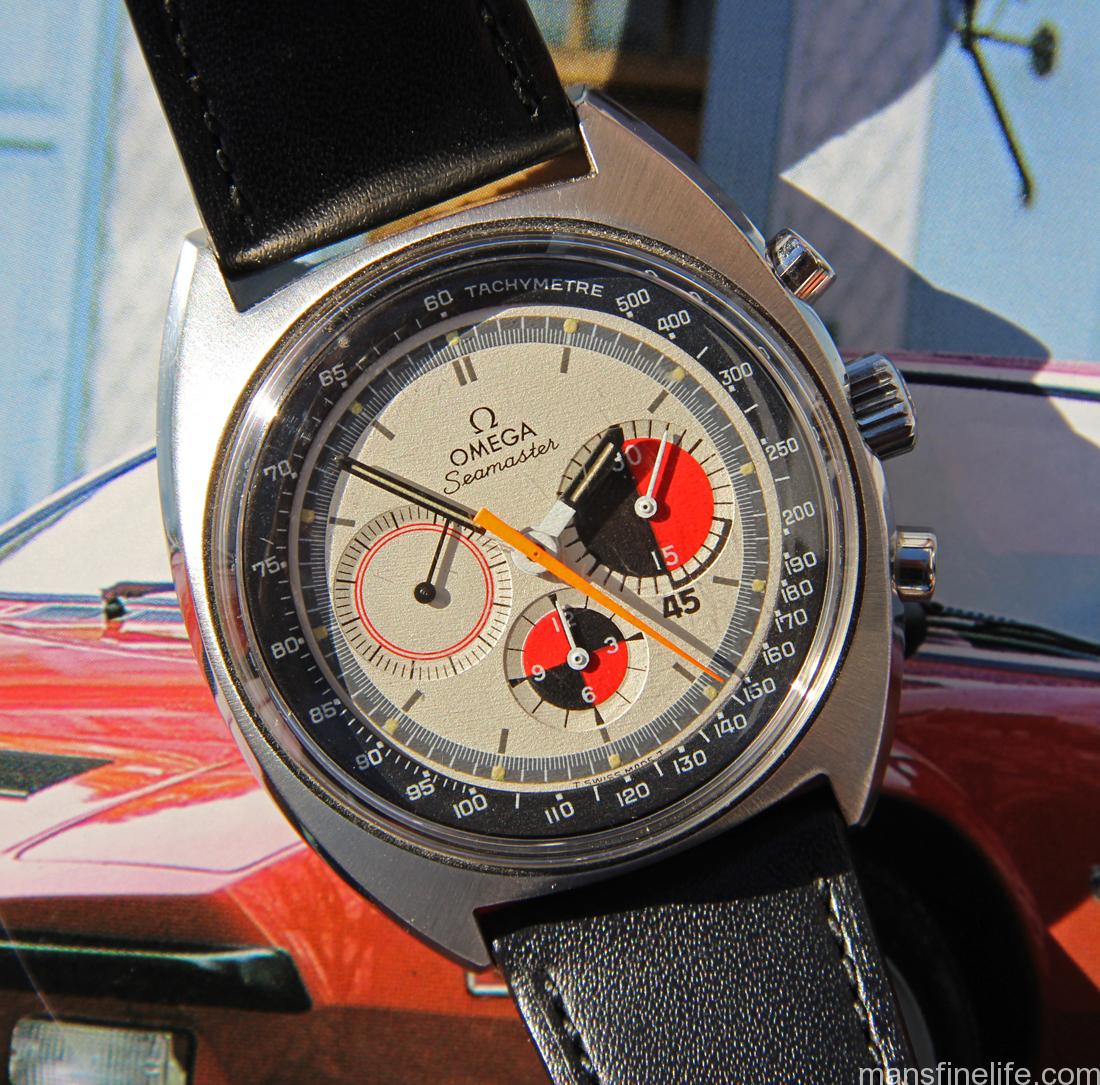
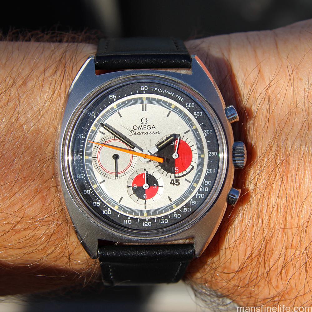
Up for sale this month is this uncommon late 1960s Omega ref. 145.020 Seamaster “Soccer Timer” chronograph with beautiful original cream-white dial featuring high contrast red/black sub registers and an inner fixed Tachymeter ring. While it was originally believed that these chronos were manufactured for use in yachting regattas the accepted wisdom now is that they were designed for soccer trainers and referees with the addition to the minute register of a figure for 45 minutes, the length of a football half.  Either way, it is an awesome looking watch and in fact the dial design was so striking and distinctive that recently Omega reissued some modern versions of it.

omega145020soccer-sun-copy

This fantastic and ultra-cool Soccer Timer features sharp chamfers and essentially perfect sunburst satin finish on top of the large 40mm case. Even better, though, is the gorgeous original creamy-white Omega Tritium dial featuring a finely articulated dark gray minute track and red/black sub-registers, with the oversized minute counter specially marked to easily read 45-minute intervals. The dial has a delightful textured matte finish, shows very few signs of age and all Tritium lume plots are present and have acquired a pleasing patina. The bold matching hour and minute hands and fluorescent orange chrono sweep seconds just complete what is simply a terrifically pleasing and unique original Omega Seamaster Soccer Timer layout in top condition.

omega145020soccer-move-copy

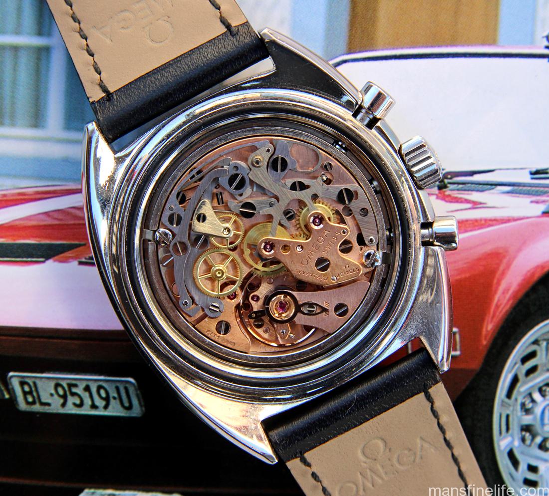
Under the hood is the redoubtable Omega manual-wind caliber 861, the same workhorse as found in their famed Moonwatch after they phased out the legendary cal. 321. With a 27 million serial number dating it to circa 1968 and looking very bright and pristine, this classic chrono movement had a complete service at Omega UK in 2013 and so is running like a champ, with all timekeeping and chronograph functions operating flawlessly.
omega145020soccer-wrst-copy

When you look at how the prices of vintage mechanical chronos have skyrocketed in the past few years, the Omega Soccer Timer remains a premium piece that is still reasonably affordable for both the aspiring or experienced collector. If anything, a beautiful example like this one has got upside potential once people figure out it’s a better quality watch than many others currently in its price range. For style, functionality and pure funky cool you can’t go wrong with this beautiful cream dial Soccer Timer. You’re sure to be noticed in the best possible way.
Check out the complete ad with many more pictures and full condition report over at the excellent OmegaForums.net’s Private Watch Sales forum.  SOLD

tomvox1’s Watches for Sale — September selection

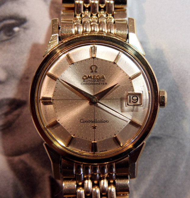
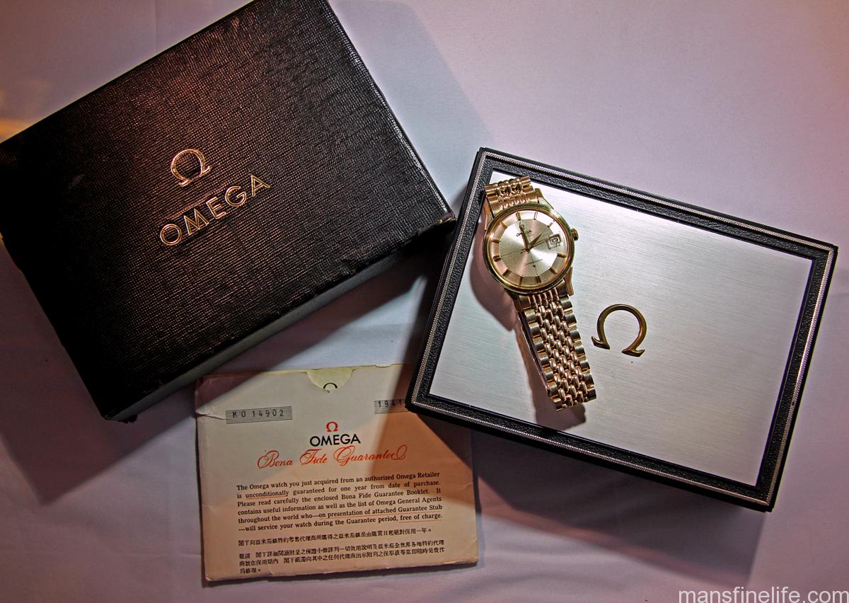
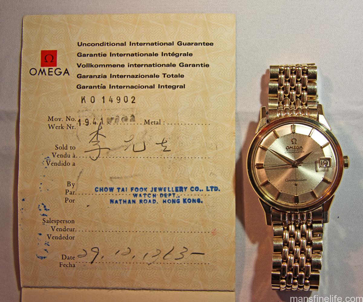
Well here’s something you don’t find every day: a 55-year-old watch with its original boxes and papers! But that’s the case with this classic gold-capped vintage 1961 Omega Constellation that I’m offering this month. Not only is it in truly Excellent and unmolested vintage condition with no signs of polish, an all-original non-luminous crosshair dial and its original plated Beads of Rice bracelet but it’s also accompanied by its original double box-set and matching guarantee papers. And that turns an already cool vintage watch into collector grade just like that.

14092conniebp-bp-copy

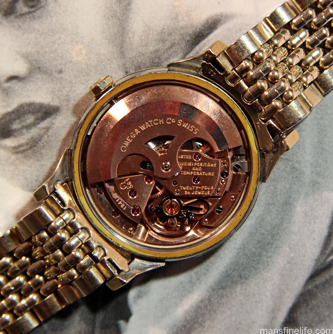
Under the hood is the fantastic Omega automatic caliber 561, arguably part of the best family of mass-produced movements in the history of horology. It features 24-jewels, a semi-quickset date function and has 5 positional adjustments and one for temperature. This fine tuning enabled the 561 to pass its time-keeping tests with flying colors and that’s why it was such a successful movement for Omega’s flagship line, the always Chronometer-rated Constellation.

14902conniebp-move-copy

Take affordability, elegance and mechanical precision along with classic early-60s Gerald Genta-designed vintage style and add then hard to find pieces of original provenance and you’ve got a special package for the discerning collector. That this Connie has survived for so long in such great original condition and still is paired with its factory packaging and paperwork is nothing short of magical. At least that’s the way I look at these sort of wonderful vintage watch finds. And if you’re reading this I bet you do, too.

14092conniebp-paps-copy

Check out the complete ad with many more pictures and full description over at the excellent OmegaForums.net’s Private Watch Sales section. BLOWOUT SALE

tomvox1’s Watches for Sale — July selection

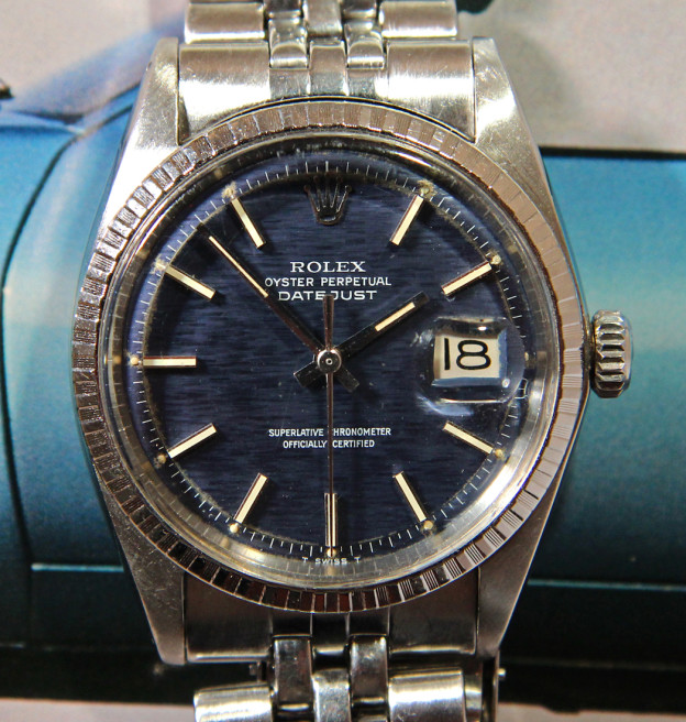
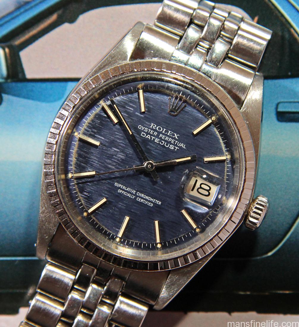
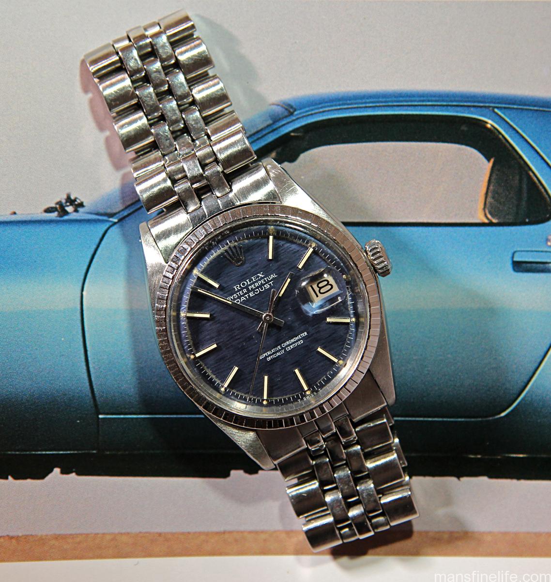
On offer as we wind down July is an always in-style classic vintage Rolex Datejust in steel. Only this one has a special twist — a very uncommon textured blue dial. Dating from the early 1970s, this is a reference 1603, which means a Datejust with steel “Castellated” patterned engine-turned bezel, and it come from an era when Rolex simply didn’t produce that many DJs in blue. Relatively common in 35mm Date models but not a lot of Rolex’s full size 36mm flagship model had them for whatever reason.

1603DJBlue-10 copy

Like a lot of blue dials from back in the day, this beautiful pie-pan shows signs of oxidation and reaction to the Tritium luminous plots. But that only adds to the overall vintage charm of this handsome and versatile watch. Built Rolex tough, I don’t really think the stainless steel case has ever been polished. Well worn, yes, but polish is not really evident, as it features thick lugs, undistorted lug holes and sharp edges.

1603DJBlue-lng copy

It comes on its original Rolex USA-made Jubilee style bracelet and better yet, the great caliber 1575 workhorse movement has just been fully overhauled for years more faithful service. If you’re seeking the classic look of a vintage Rolex Datejust but one with a dial color that elevates it to something a little more special, you may well have found your watch.

Check out the full ad with complete condition report and many more pictures over at Vintage Rolex Forum’s Market section. SOLD

tomvox1’s Watches for Sale — June selection

We are surely ending the month of June with a bang because have I got something special for you haute horology buffs. Up for sale on consignment is this absolutely stunning Patek Philippe reference 2552, aka the true “Disco Volante”. A marvel of mid-century engineering inside and out, the Disco Volante gets its name from its large, round 36mm diameter and tall, double-stepped bezel, making it look a bit like a flying saucer. Though that said, it’s definitely more suited to black tie than Area 51.

PP2552-crwn copy

Of course this heavy yellow gold classic 1950s men’s dress watch is beautiful on the outside, as you’d obviously expect, with a stunning original eggshell dial that has acquired a gorgeous ivory patina through the years. But it might get even better under the hood where you’ll find Patek’s first-ever automatic movement, the legendary caliber 12-600 AT, ticking away. Far ahead of its time when it was introduced, the 12-600 AT features 30 jewels, the Geneva seal reserved only for exceptional calibers, a solid 18k rotor with stunning engine turned engraving that winds in both directions for maximum efficiency, 5 positional adjustments, as well as further adjustments for heat, cold and isochromism, and Patek’s patented Gyromax balance and a top flight Breguet hairspring all beating at a rapid 19,800 bph. And did I mention it is drop dead gorgeous to behold?

PP2552-move copy

This fantastic machine has just been fully serviced for years’ more faithful service to its new owner and this wonderful Disco Volante also comes with a genuine Patek croc strap. Better yet, it has its period correct 18k Patek buckle, too, a valuable accessory in its own right. Continue reading

Rolex Collector’s Notebook: The mystery of the “Neat Fonts” matte meters-first 5512 Submariner dial

Grateful thanks for this article go to timlua and HQ Milton for kindly contributing their dials and data. Thank you, gentlemen! I’m also especially indebted to the great collector & Man’s Fine Life contributor Beaumont Miller II, not only for sharing his watch photos but also for his invaluable insights about the “Neat Fonts” dial, its place in matte dial chronology and particularly his excellent observations on its similarity to the mid-1960s gilt Sub dials. My heartfelt appreciation for sharing your expertise, my friend — couldn’t have done this without you!

One of the things that makes collecting vintage watches so interesting, and Vintage Rolex in particular, is trying to decode the subtle changes that took place in ostensibly “identical” watches those many years ago. We see evolutions in movements, in cases but most intriguingly we see variations in dial layouts and typography. And just when you think you’ve figured out a dial sequence and its logical chronology, something else out of the ordinary comes along and makes you look at things with fresh eyes.

timlua's 5512 from the VRF Dial Archive -- the watch that put me on the hunt

timlua’s 5512 from the VRF Dial Archive — the watch that put me on the hunt.

Such is the case with what I call the “Neat Fonts” matte meters-first 5512 dial. I first saw this interesting dial several years ago, when a Vintage Rolex Forum member named timlua submitted his mid-1960s 5512 for the Dial Archive. I knew I had to have one… and it took me 8 more years to hunt one down. As you can clearly see and what struck me right away, the printing on this dial is not at all like what we normally see on the first generation of matte meters-first 551x dials.

A standard matte meters-frist dial -- courtesy HQ Milton

A standard matte meters-first dial — courtesy HQ Milton

Those first gen matte dials for the Submariner have always had a particularly “first draft” quality to my eye, with rather scraggly fonts and slightly uneven printing. And it makes sense that Singer, undertaking their first try at this new matte-style of dial manufacture and departing their tried and true gilt/gloss method of dial printing, might have had some teething issues with their printing techniques. But not so the “Neat Fonts” 5512 dial. You can already see the clean typography that would become a hallmark of the later 1960s and early 1970s Singer dials: nicely proportioned, flat-ish bottom Coronet with a small “mouth”; SUBMARINER text very clean with a distinctive snake-like “S”; and the depth rating pretty level with minimal jump to the numbers and open 6s.

5512MetersFirst-dial-edit

In fact, the “Neat Fonts” dial does not resemble the Mark I meters-first Sub dials at all. It actually resembles the pre-Bart gilt/gloss dials of the middle 1960s with their high standards of printing and execution. So much so that aside from the application of the SWISS – T<25 you might even think that Singer used the same dial dye for the process. Perhaps they did after figuring out how to utilize that gilt-era dye/tampon, which featured a reverse printing method, and apply it to the paint-on-top method of the matte dials. But more likely they returned to it as a template for the new matte-style dye and that is why they are so similar if not quite identical.

5513gilt-coronet 5512MetersFirst-coronet

5513gilt-depth 5512MetersFirst-depth

It also shares some characteristics with the Mark III Red Submariner dial, particularly the fonts for the depth rating, the SCOC text and the odd little feature of the dash in the “SWISS – T<25” not quite being centered over the “30” tick.

Photo courtesy Beaumont Miller II

Photo courtesy of Beaumont Miller II

5512MetersFirst-depth_SCOC

Photo derived from Vintage Rolex Forum's Classic "Everything Red Sub" by Mark Lerman

Photo derived from Vintage Rolex Forum’s Classic “Everything Red Sub” by Mark Lerman

(If you visit the great site DoubleRedSeaDweller.com you can also see that the SCOC text on the Neat Fonts and Mark III Red Sub is highly similar in format/style to the Mark I 1665 Double Red Sea-Dweller, indicating another connection there.)

Making this iteration even more interesting is that unlike just about every no-date Sub Rolex ever made, the “Neat Fonts” dial is always to the best of my knowledge found only in 5512s and never 5513s. Continue reading

tomvox1’s Vintage Watches for Sale — March selection, Pt. II

Proving that a mid-sized watch can still be tough and cool this uncommon vintage Ernest Borel Sub 200T Sharkhunter diver with stunning eccentric matte Tritium lume dial & original matching handset is now up for grabs on all the big forums.

ErnestBorelSharkhunter-6 copy

The story on this Sharkhunter, which is like a 37mm cross between a Submariner and Doxa’s larger, more famous model with the same name, is that at the time this watch was produced in the early 1970s the Synchron Aubrey* company owned Doxa & Borel and had no compunction about using virtually identical dials and model nomenclature across two ostensibly separate brands (*corrected thanks to info provided by @vintagediver on IG — thank you!).

ErnestBorelSharkhunter-move copy

This well-made, rugged tool watch features the ever reliable ETA cal. 2872 movement with quickset date, shock protection and beautiful gilt finish. And putting the cherry on top of the sundae, this tough ETA movement has just been fully overhauled by my watchmaker for years more of faithful service.

ErnestBorelSharkhunter-wrst copy

Ideal for the guy who favors an under-40mm watch, this Borel diver has the striking tool watch looks and the desirable vintage originality to make a greater impression than its relatively modest price tag would suggest. Get it while you can so you can be ready for any ocean adventure and then look super stylish for beachside cocktails afterwards.

Check out the full ad with many more pictures and complete description over at Timezone.com’s Sales Corner.  ON HOLD

tomvox1’s Vintage Watches for Sale — March selection

On offer this month is this absolutely stunning mid-1970s vintage Rolex reference 5512 Submariner. The true Steve McQueen watch — don’t let anyone tell you differently — the 5512 is the iconic Chronometer-rated no date Sub, which was produced in ever diminishing numbers as time went on and Rolex realized that not many customers cared enough about the fancy movement to pay the higher price when compared with the standard non-Chronometer cal. 1520 5513 model. It was, in fact, discontinued in the late 70s.

5512NonSerif-4 copy

But the discerning few were willing to pony up then and still are today. This is one of those magic Rolex Sports models that you come to appreciate as you learn the history of Rolex’s dive watches and how they all fit together in the big picture. Simply put, the 5512 is an elite Submariner and a cut above most matte 5513s or 1680s, all other things being equal.

5512NonSerif-move copy

And this particular example is even a bit more special than most other matte 5512s. Along with its beautiful 4-line SCOC dial (technically referred to as “Non-Serif” style in the ever more complex glossary of dial definitions) it displays a plethora of all-original qualities: wonderfully patinated Tritium luminous; matching original hands; a sexy Fat Font bezel insert with Tritium pearl; domed acrylic crystal for that unbeatable vintage look; and it even comes with its original Folded Oyster bracelet with “PATENTED” diver’s extension. It’s not easy to find a 40-year-old watch in this sort of all around period correct condition — this baby is truly a survivor!

McQueen,Sub,Persol

To put the cherry on top of the sundae, this great 5512 has just been fully overhauled for years’ more faithful service to its new owner. If you’re looking for an elite Rolex tool watch with that extra special, extra collectible quality of 100% period correctness — not to mention that magical McQueen connection — look no further. Your Submariner has arrived.

5512NonSerif-lng copy

Check out the complete ad with many more pictures and complete description over at the Vintage Rolex Forum’s Market section  SOLD

tomvox1’s Vintage Watches for Sale — February selection

I have previously extolled the humble virtues of the vintage Eterna KonTiki 20 but I have never come across a more unique example than this one. Sun and time have conspired to bleach the dial down to its most elemental hue, that of a remarkable bright bronze that changes tone in different light and with the angle of your wrist.

EternaKonTikiBronze-angl2 copy

The condition of the all steel case matches the life well lived of this incredible dial, making this is a watch that is simply vintage magic on the wrist with stories to tell. With a nicely sized 36mm diameter and a water resistant steel case with screwed back & oversized crown the KonTiki 20 has classic rugged good looks. It’s not a watch you have to baby, even after all these years.

EternaKonTikiBronze-move copy

Featuring a high grade Eterna-modified ETA movement, the caliber 1489K has shock protection and a very cool quickset date feature via pulling the crown out past the time setting position repeatedly. But again, the real star is this remarkable dial. Not only is the golden bronze tone stunning but the unique aging just happened to occur to an already “exotic”-type dial with red minute track ring and ridged markers with funky butterscotch-toned inlays.

EternaKonTikiBronze-wrst copy

About as cool as they come and priced well below a grand, this Tropical KonTiki is destined to be snapped up by a discerning fan of wabisabi in vintage watches, an ever growing fraternity. If you’re quick enough on the draw, it you could be you joining the club.

Check out the full ad with many more pictures and complete description over at Timezone.com’s Sales Corner.  SOLD

The Allure of Military Watches — The Blancpain Fifty Fathoms “No Radiations” Bundeswehr

First off, let me say I don’t claim to be an expert on the vintage Blancpain Fifty Fathoms “No Radiations” Bundeswehr-issued diver. Everything I’ve learned is from other, more knowledgeable collectors sharing their considerable expertise about this model with me. That said, I have owned two of them so I thought it would be useful to at least present what I do know about the watch, as well as what are hopefully some helpful pictures.

BPFFAngl

The issued Blancpain Fifty Fathoms “No Radiations” dive watches were requisitioned by the German Bundeswehr (Armed Forces) for their elite naval commando unit, the Kampfschwimmer, from around the mid-1960s until the early 1970s, when they were replaced with another model of BPFF (the big cushion shaped one with the crown at “4”, a red 3H on the dial to denote Tritium and the co-called “sterile” bezel with luminous triangle only and no numerals or hash marks). It’s no surprise that the German Navy chose Blaincpain divers for their elite frogmen forces. From its earliest conception the Fifty Fathoms was meant to be a serious purpose built diver, as proven by its legendary connection to the great Jacques Cousteau nearly from the start. The design was so good that the “No Radiations” version from the 1960s can directly trace its lineage to the models made for for the US Navy in the 1950s, the legendary MilSpec 1 and the even more uncommon Tornek-Rayville. (While the TR 900 is technically not considered a Blancpain Fifty Fathoms, the MilSpec & TR 900 are almost identical and certainly Allen Tornek was re-badging Rayvilles as Blancpains all along — so what is the difference between a Rayville that doesn’t have “Blancpain” on the dial and one that does really — aside from rarity, that is?).

BPFF2-1alter

The idiosyncratic red & yellow crossed-out trefoil badge with a tiny “No Radiations” printed within took the place of the earlier models’ moisture indicator disc above the “6” marker and made a virtue out of the new regulations regarding radioactivity on wristwatches, the famous “T<25” standard. No doubt the previous 1950s versions of Fifty Fathoms utilized highly radioactive Radium for their super luminous dials and bezels, like so many other watchmakers at the dawn of the Toolwatch era, as well as a rumored incorporation of the even deadlier Promethium. And so the “No Radiations” badge was a very overt way for Blancpain to indicate that they had broken from the use of highly radioactive lume and were now firmly on board with the “Less than 25 milicuries of Tritium maximum” mandate codified in the early 1960s. This had the added benefit of making the watch suitable for military duty, as the T<25 standards were also strictly enforced in the martial world, with older Radium-lumed watches regularly being scrubbed at service, re-lumed with Tritium and then returned to duty. And just to be certain that they were getting the message across, Blancpain still printed “T < 25 MC” at a cocky angle below the “5” marker, one of the few companies aside from Rolex to use such a clear literal notation of the radioactive content of their dial & hands.

BPFFFAce1

The case of the “No Rads” Fifty Fathoms in a nicely sized 40mm across without the crown by around 50mm lug-to-lug. It has an all-steel three-piece screwed construction, more polished than a MilSpec but sharing the long sweeping lugs with squared off edges. Continue reading

tomvox1’s Watches for Sale — January selection, Pt. IV

As collectors in any hobby know, sometimes you’ve got to sell something special to get something special. Such is the case with my trusty Panerai Luminor Marina PAM 61, a watch I”ve had for many years and never thought of parting with. However, something special has come up on my radar and I’ve made the tough decision to let this stunning Tobacco-dialed titanium beauty go. But my loss can be your gain.

PAM61-2 copy

With a D-serial number prefix this 61 was produced circa 2001 in 3000 examples that year and still features a solid titanium back and not a display version, something Panerai purists prefer. It has a tough and durable 44mm titanium case construction incorporating Panerai’s proprietary oversize crown guard, a well protected lever-locking system. Hard to beat that machine-like crown locker for cool factor not to mention the form-follows-function contribution it makes to the model’s impressive 300 Meters of water resistance.

PAM61-move copy

There’s also a chronometer movement under the hood, the workhorse OP II which is a modified ETA 6497-2 with bespoke decoration. The watch keeps great time and wears like a dream due to the lighter-than-steel titanium case. And the brushed finish tones down the normal Panerai bling factor, making the 61 a more subtle everyday option than their highly polished steel brethren. But the real wow factor is that great Tobacco-brown dial with matte finish. Between the gray of the case and whatever strap you put on, this watch absolutely pops on the wrist with its wonderfully warm brown look. You might call it an autumn but believe me it’s perfect all year round!

PAM61-bk copy

Check out the complete ad over at the great Paneristi Forum’s Collector’s Market for many more pics and complete description. ON HOLD