Tag Archives: Chronometer

1968 Vintage Rolex 1600 Datejust Smooth Bezel

tomvox1’s Watches for Sale — 1968 Vintage Rolex 1600 Datejust Smooth Bezel

It may be a new year but my obsession remains great vintage watches. Which is why I’m very happy to make my first offering of 2019 a classic and uncommon reference 1600 Rolex Datejust with smooth bezel in all-stainless steel.

1968 Vintage Rolex 1600 Datejust Smooth Bezel

This 1600 DJ dates from 1968 and features a super clean silver sunburst dial with original Tritium luminous and a minimally polished case. The special thing about the 1600 Datejust is its smooth, Explorer-style bezel. This reference was also made in much fewer numbers than the more ubiquitous fluted white gold bezel 1601 and the castellated steel 1603.

1968 Vintage Rolex 1600 Datejust Smooth Bezel

On the wrist all those clean lines translate into an absolute knockout. Even better, the stalwart caliber 1575 Chronometer movement has been recently serviced for maximum future reliability and faithful service for many more years to come.

1968 Vintage Rolex 1600 Datejust Smooth Bezel

Supplied with a very attractive and suitable shell cordovan strap this Datejust is a beautiful synthesis of sportiness and elegance. Its timeless design is just as handsome and masculine today as it was when it was manufactured those 50 years ago. So start the year in classic vintage Rolex style and make this great Datejust your own today!

1968 Vintage Rolex 1600 Datejust Smooth Bezel

Check out the complete ad with many more pictures and complete condition report over at Vintage Rolex Forum’s Market section. You’ll be glad you did.  SOLD

tomvox1’s Watches for Sale — July selection

Kicking off summer and this most patriotic month I have a real sparkler of a vintage watch on offer — a beautiful pink gold capped C-shape Constellation. Dating from circa 1966 this Mad Men-esque beauty features Omega’s bold, sweeping lug design that ushered in a new stylistic era for their flagship Constellation line. And this pink gold capped version is surely one of the more uncommon iterations.

PGCapC-shapeConnie-lng copy

Furnished on its ultra-rare matching pink plated brick link bracelet, this Connie makes a stunning and refined impression on the wrist. Best of all all its various collector elements match perfectly: solid 14k pink gold smooth bezel, correct pink crown, solid pink gold Observatory medallion on the back, pink dial furniture and even a pink tension ring on the Omega-signed acrylic crystal! That sort of originality is pretty hard to come across in a 50-year-old watch.

PGCapC-ShapeConnie-move copy

This Connie also features its original and beautiful silver non-luminous dial and matching non-luminous stick hands. I am big fan of this elegantly slim, almost minimalist dial and hands combo and I think once you strap it on you will be, too. To make matters even sweeter, the exceptional 561 Chronometer caliber was serviced recently and so is ready for years’ more faithful service to its new owner. Accuracy, rarity and uniquely classy style all at an eminently reasonable price — what more could you ask for in a vintage dress watch?

PGCapC-ShapeConnie-bk copy

Check out the complete ad with many more pictures and complete condition report over at the always excellent Omega Forums Private Sales corner. SOLD

Rolex Collector’s Notebook: The mystery of the “Neat Fonts” matte meters-first 5512 Submariner dial

Grateful thanks for this article go to timlua and HQ Milton for kindly contributing their dials and data. Thank you, gentlemen! I’m also especially indebted to the great collector & Man’s Fine Life contributor Beaumont Miller II, not only for sharing his watch photos but also for his invaluable insights about the “Neat Fonts” dial, its place in matte dial chronology and particularly his excellent observations on its similarity to the mid-1960s gilt Sub dials. My heartfelt appreciation for sharing your expertise, my friend — couldn’t have done this without you!

One of the things that makes collecting vintage watches so interesting, and Vintage Rolex in particular, is trying to decode the subtle changes that took place in ostensibly “identical” watches those many years ago. We see evolutions in movements, in cases but most intriguingly we see variations in dial layouts and typography. And just when you think you’ve figured out a dial sequence and its logical chronology, something else out of the ordinary comes along and makes you look at things with fresh eyes.

timlua's 5512 from the VRF Dial Archive -- the watch that put me on the hunt

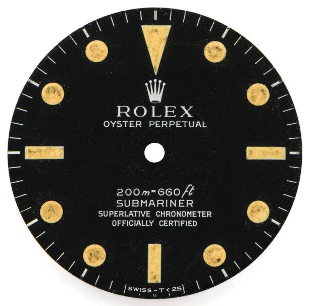
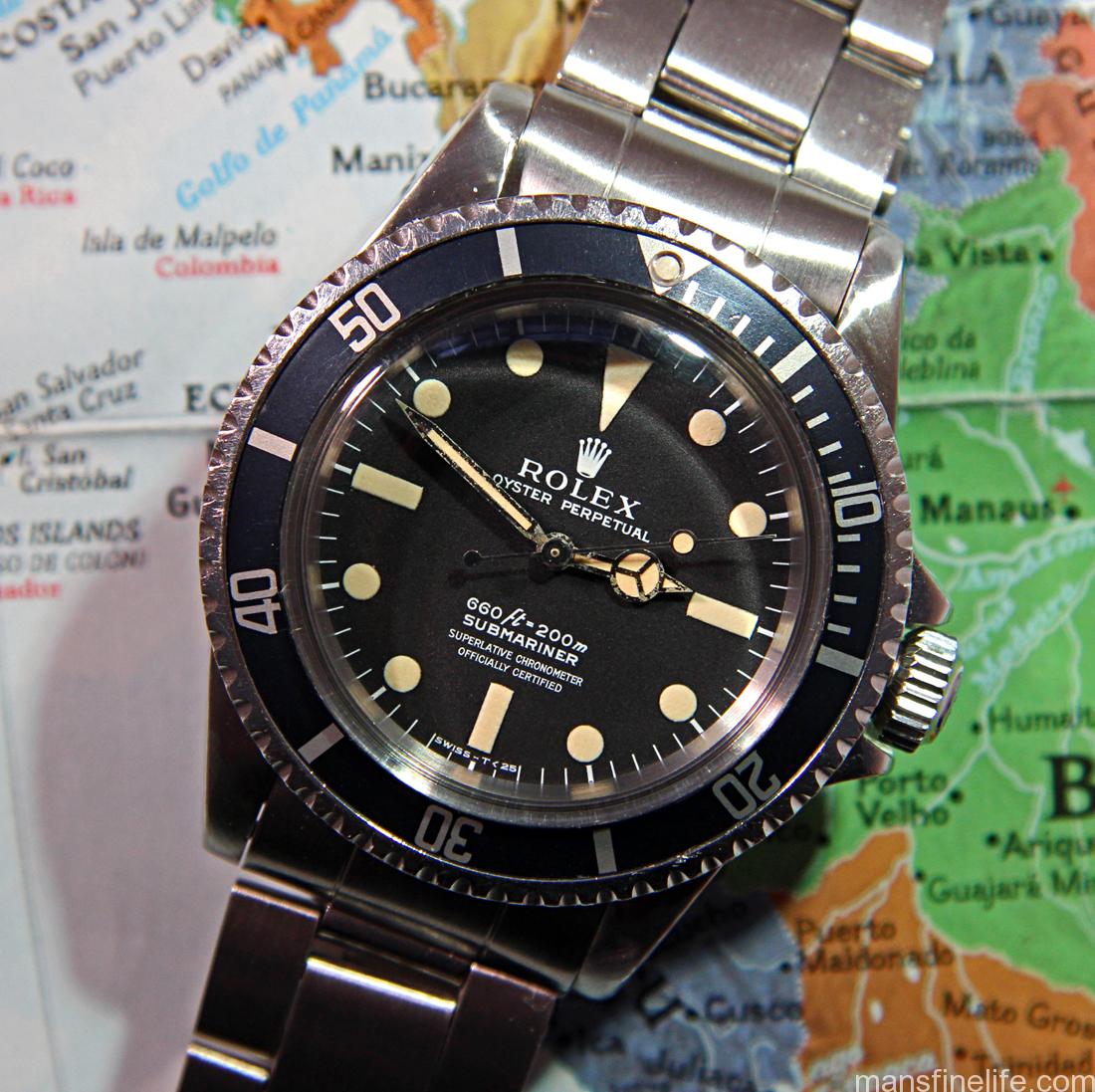
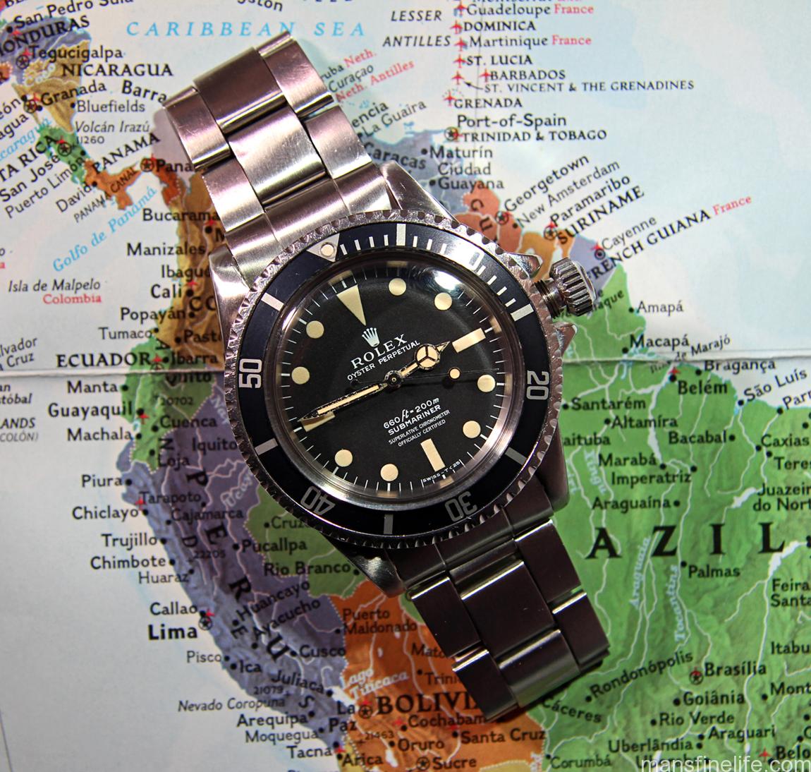
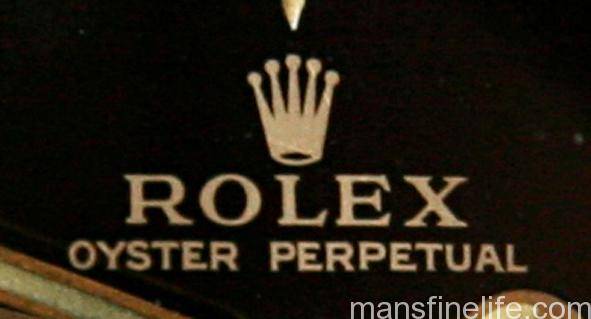
timlua’s 5512 from the VRF Dial Archive — the watch that put me on the hunt.

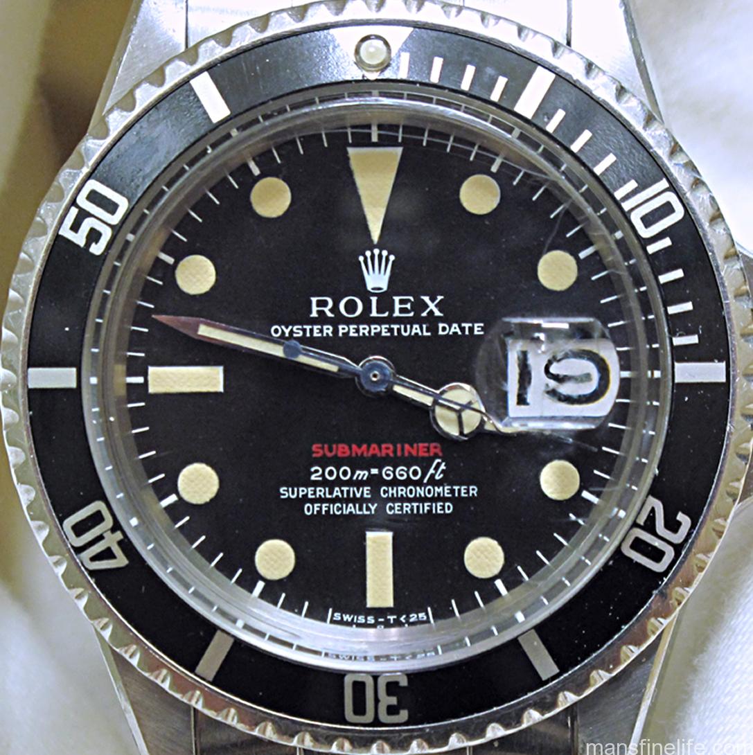
Such is the case with what I call the “Neat Fonts” matte meters-first 5512 dial. I first saw this interesting dial several years ago, when a Vintage Rolex Forum member named timlua submitted his mid-1960s 5512 for the Dial Archive. I knew I had to have one… and it took me 8 more years to hunt one down. As you can clearly see and what struck me right away, the printing on this dial is not at all like what we normally see on the first generation of matte meters-first 551x dials.

A standard matte meters-frist dial -- courtesy HQ Milton

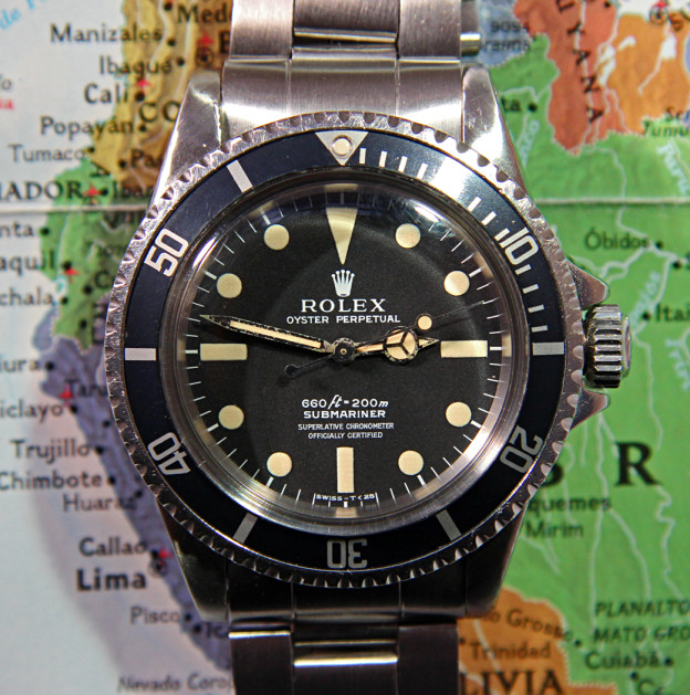
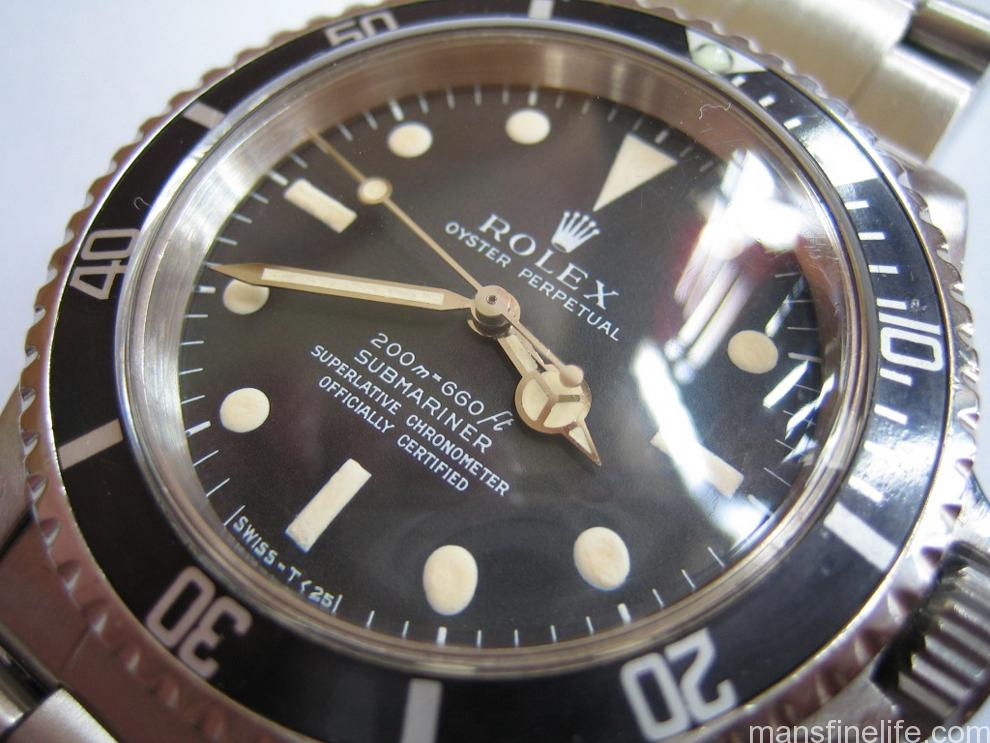
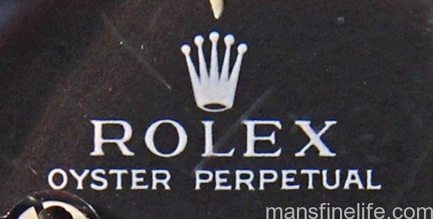
A standard matte meters-first dial — courtesy HQ Milton

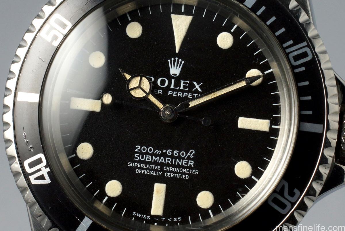
Those first gen matte dials for the Submariner have always had a particularly “first draft” quality to my eye, with rather scraggly fonts and slightly uneven printing. And it makes sense that Singer, undertaking their first try at this new matte-style of dial manufacture and departing their tried and true gilt/gloss method of dial printing, might have had some teething issues with their printing techniques. But not so the “Neat Fonts” 5512 dial. You can already see the clean typography that would become a hallmark of the later 1960s and early 1970s Singer dials: nicely proportioned, flat-ish bottom Coronet with a small “mouth”; SUBMARINER text very clean with a distinctive snake-like “S”; and the depth rating pretty level with minimal jump to the numbers and open 6s.

5512MetersFirst-dial-edit

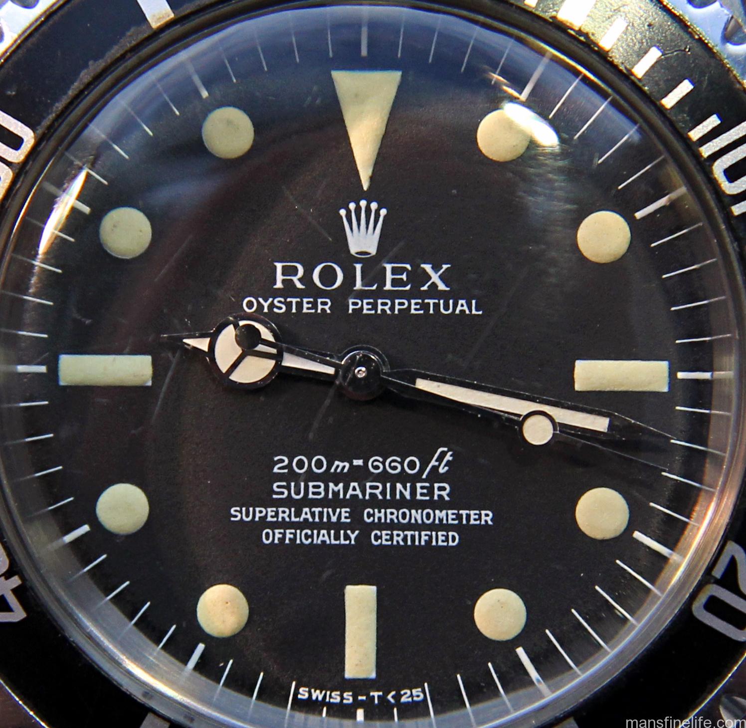
In fact, the “Neat Fonts” dial does not resemble the Mark I meters-first Sub dials at all. It actually resembles the pre-Bart gilt/gloss dials of the middle 1960s with their high standards of printing and execution. So much so that aside from the application of the SWISS – T<25 you might even think that Singer used the same dial dye for the process. Perhaps they did after figuring out how to utilize that gilt-era dye/tampon, which featured a reverse printing method, and apply it to the paint-on-top method of the matte dials. But more likely they returned to it as a template for the new matte-style dye and that is why they are so similar if not quite identical.

5513gilt-coronet 5512MetersFirst-coronet

5513gilt-depth 5512MetersFirst-depth

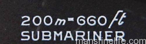
It also shares some characteristics with the Mark III Red Submariner dial, particularly the fonts for the depth rating, the SCOC text and the odd little feature of the dash in the “SWISS – T<25” not quite being centered over the “30” tick.

Photo courtesy Beaumont Miller II

Photo courtesy of Beaumont Miller II

5512MetersFirst-depth_SCOC

Photo derived from Vintage Rolex Forum's Classic "Everything Red Sub" by Mark Lerman

Photo derived from Vintage Rolex Forum’s Classic “Everything Red Sub” by Mark Lerman

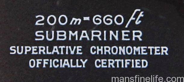
(If you visit the great site DoubleRedSeaDweller.com you can also see that the SCOC text on the Neat Fonts and Mark III Red Sub is highly similar in format/style to the Mark I 1665 Double Red Sea-Dweller, indicating another connection there.)

Making this iteration even more interesting is that unlike just about every no-date Sub Rolex ever made, the “Neat Fonts” dial is always to the best of my knowledge found only in 5512s and never 5513s. Continue reading

tomvox1’s Vintage Watches for Sale — March selection

On offer this month is this absolutely stunning mid-1970s vintage Rolex reference 5512 Submariner. The true Steve McQueen watch — don’t let anyone tell you differently — the 5512 is the iconic Chronometer-rated no date Sub, which was produced in ever diminishing numbers as time went on and Rolex realized that not many customers cared enough about the fancy movement to pay the higher price when compared with the standard non-Chronometer cal. 1520 5513 model. It was, in fact, discontinued in the late 70s.

5512NonSerif-4 copy

But the discerning few were willing to pony up then and still are today. This is one of those magic Rolex Sports models that you come to appreciate as you learn the history of Rolex’s dive watches and how they all fit together in the big picture. Simply put, the 5512 is an elite Submariner and a cut above most matte 5513s or 1680s, all other things being equal.

5512NonSerif-move copy

And this particular example is even a bit more special than most other matte 5512s. Along with its beautiful 4-line SCOC dial (technically referred to as “Non-Serif” style in the ever more complex glossary of dial definitions) it displays a plethora of all-original qualities: wonderfully patinated Tritium luminous; matching original hands; a sexy Fat Font bezel insert with Tritium pearl; domed acrylic crystal for that unbeatable vintage look; and it even comes with its original Folded Oyster bracelet with “PATENTED” diver’s extension. It’s not easy to find a 40-year-old watch in this sort of all around period correct condition — this baby is truly a survivor!

McQueen,Sub,Persol

To put the cherry on top of the sundae, this great 5512 has just been fully overhauled for years’ more faithful service to its new owner. If you’re looking for an elite Rolex tool watch with that extra special, extra collectible quality of 100% period correctness — not to mention that magical McQueen connection — look no further. Your Submariner has arrived.

5512NonSerif-lng copy

Check out the complete ad with many more pictures and complete description over at the Vintage Rolex Forum’s Market section  SOLD