Grateful thanks for this article go to timlua and HQ Milton for kindly contributing their dials and data. Thank you, gentlemen! I’m also especially indebted to the great collector & Man’s Fine Life contributor Beaumont Miller II, not only for sharing his watch photos but also for his invaluable insights about the “Neat Fonts” dial, its place in matte dial chronology and particularly his excellent observations on its similarity to the mid-1960s gilt Sub dials. My heartfelt appreciation for sharing your expertise, my friend — couldn’t have done this without you!
One of the things that makes collecting vintage watches so interesting, and Vintage Rolex in particular, is trying to decode the subtle changes that took place in ostensibly “identical” watches those many years ago. We see evolutions in movements, in cases but most intriguingly we see variations in dial layouts and typography. And just when you think you’ve figured out a dial sequence and its logical chronology, something else out of the ordinary comes along and makes you look at things with fresh eyes.
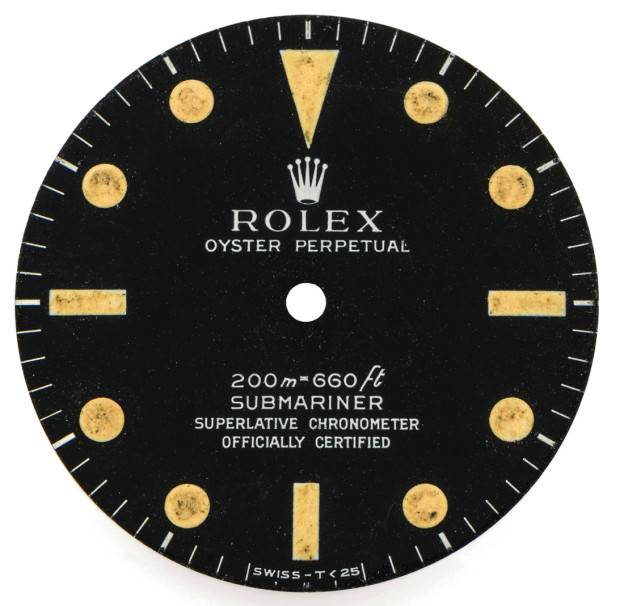
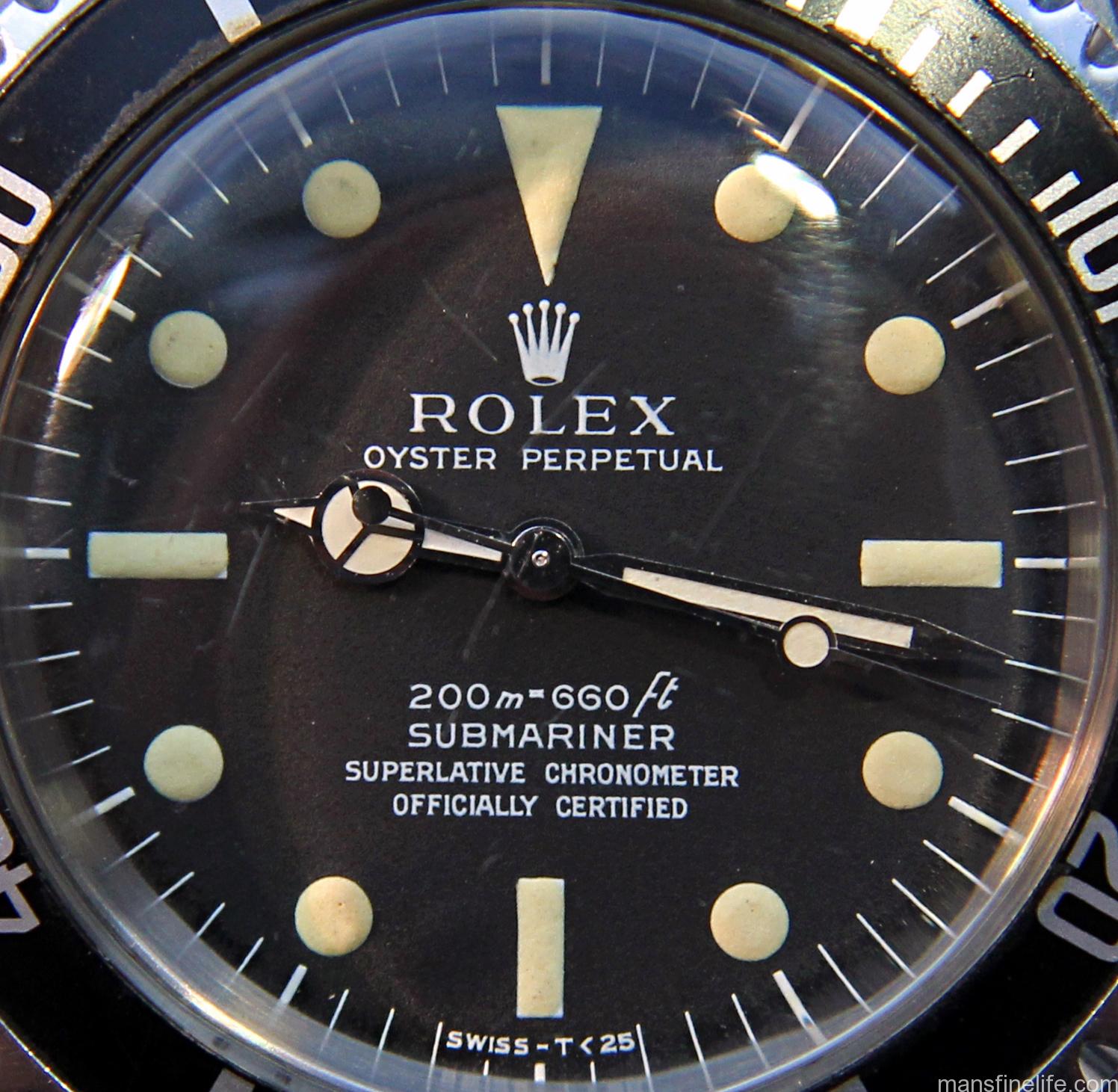
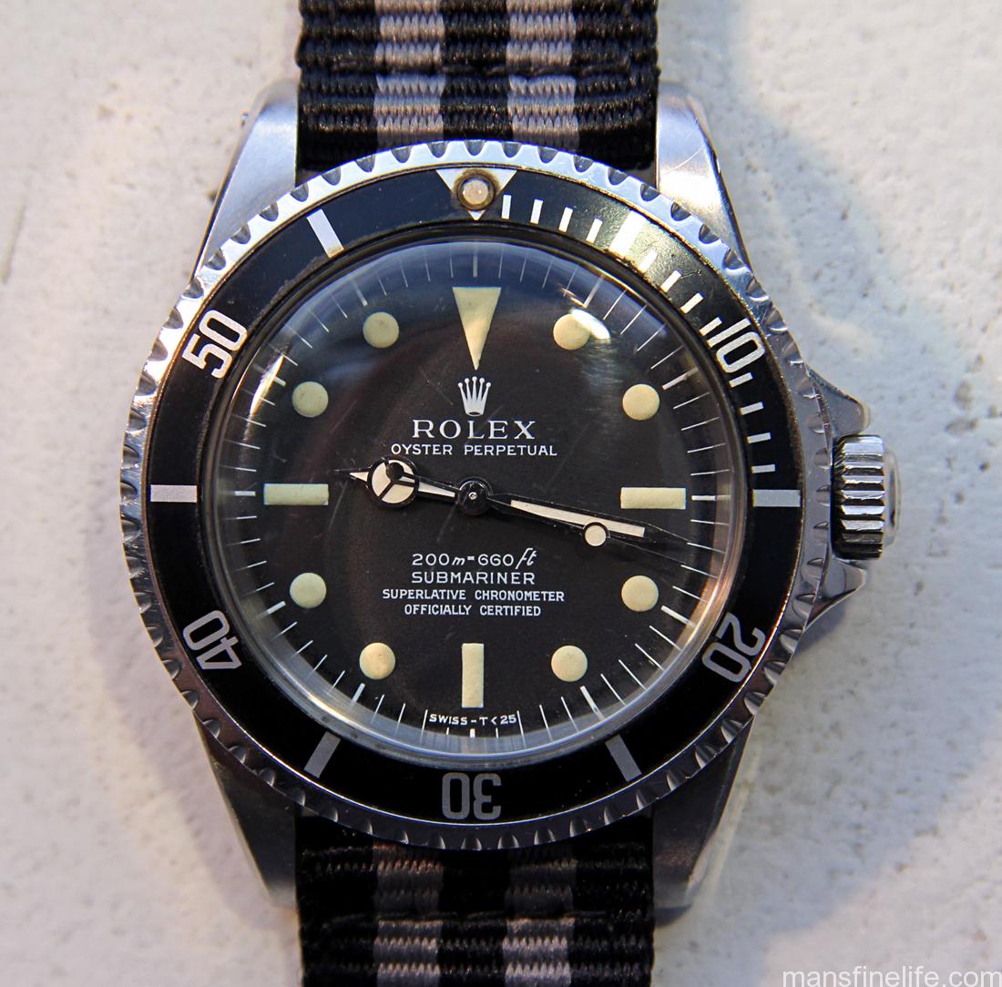
timlua’s 5512 from the VRF Dial Archive — the watch that put me on the hunt.
Such is the case with what I call the “Neat Fonts” matte meters-first 5512 dial. I first saw this interesting dial several years ago, when a Vintage Rolex Forum member named timlua submitted his mid-1960s 5512 for the Dial Archive. I knew I had to have one… and it took me 8 more years to hunt one down. As you can clearly see and what struck me right away, the printing on this dial is not at all like what we normally see on the first generation of matte meters-first 551x dials.
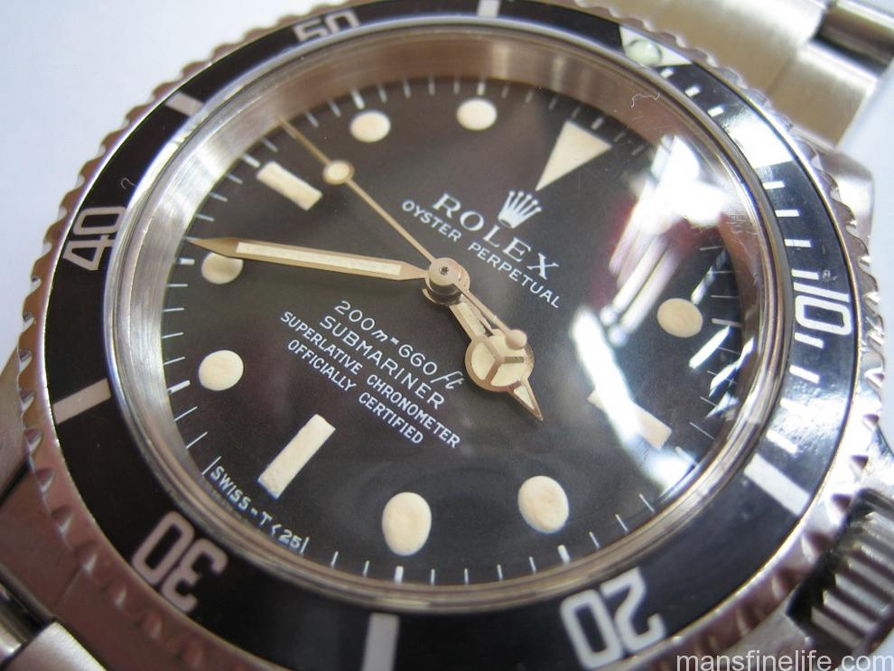
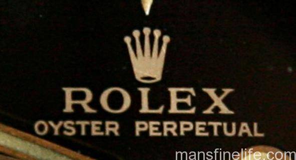
A standard matte meters-first dial — courtesy HQ Milton
Those first gen matte dials for the Submariner have always had a particularly “first draft” quality to my eye, with rather scraggly fonts and slightly uneven printing. And it makes sense that Singer, undertaking their first try at this new matte-style of dial manufacture and departing their tried and true gilt/gloss method of dial printing, might have had some teething issues with their printing techniques. But not so the “Neat Fonts” 5512 dial. You can already see the clean typography that would become a hallmark of the later 1960s and early 1970s Singer dials: nicely proportioned, flat-ish bottom Coronet with a small “mouth”; SUBMARINER text very clean with a distinctive snake-like “S”; and the depth rating pretty level with minimal jump to the numbers and open 6s.
In fact, the “Neat Fonts” dial does not resemble the Mark I meters-first Sub dials at all. It actually resembles the pre-Bart gilt/gloss dials of the middle 1960s with their high standards of printing and execution. So much so that aside from the application of the SWISS – T<25 you might even think that Singer used the same dial dye for the process. Perhaps they did after figuring out how to utilize that gilt-era dye/tampon, which featured a reverse printing method, and apply it to the paint-on-top method of the matte dials. But more likely they returned to it as a template for the new matte-style dye and that is why they are so similar if not quite identical.

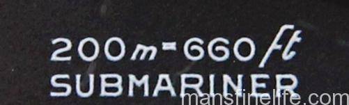
It also shares some characteristics with the Mark III Red Submariner dial, particularly the fonts for the depth rating, the SCOC text and the odd little feature of the dash in the “SWISS – T<25” not quite being centered over the “30” tick.
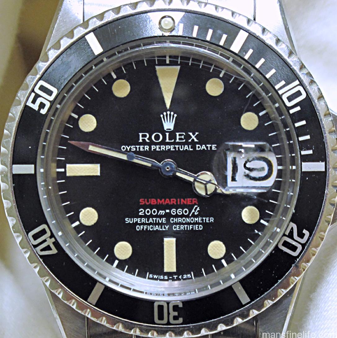
Photo courtesy of Beaumont Miller II
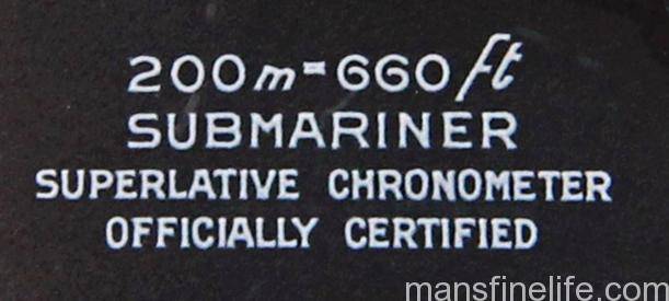
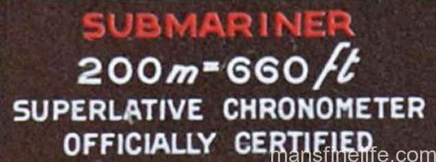
Photo derived from Vintage Rolex Forum’s Classic “Everything Red Sub” by Mark Lerman
(If you visit the great site DoubleRedSeaDweller.com you can also see that the SCOC text on the Neat Fonts and Mark III Red Sub is highly similar in format/style to the Mark I 1665 Double Red Sea-Dweller, indicating another connection there.)
Making this iteration even more interesting is that unlike just about every no-date Sub Rolex ever made, the “Neat Fonts” dial is always to the best of my knowledge found only in 5512s and never 5513s. That doesn’t sound like such a big deal until you realize that on the “Neat Fonts” dial the extra wide “Superlative Chronometer/Officially Certified” text looks to be printed at the same time as the rest of the dial text. This is unlike virtually all other 5512s with the SCOC text, from the gilt to the matte era, where that text is added after the initial dial printing. That normally makes perfect sense because then Rolex could commission one big general batch of 551x dials, determine later how many they would allocate to that year’s production of 5512s and then add the SCOC text ex post facto. But in the case of the “Neat Fonts” dial the printing was always intended for a 5512 Chronometer Sub and never a 5513, an unusual aberration in what we have come to think of as Rolex’s standard procedures.
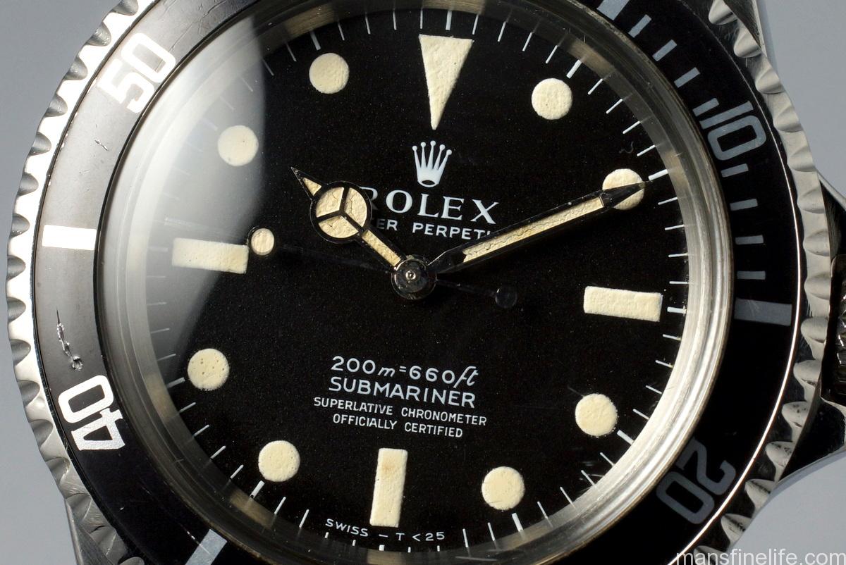
So unusual, in fact, that the “Neat Fonts” dial is very hard to come by in the wild. I would have to guess that for every 10 meters-first matte 5512s, already an uncommon watch, maybe one will have the “Neat Fonts” dial. And that leads back to the question of chronology, a question which I have yet to resolve to my satisfaction. Because despite the fact that the “Neat Fonts” 5512 dial shares certain telling characteristics with the Mark III Red Sub dial, which according to best available research is usually is found in the circa 1969 2.1 – 2.45 million serial number range, the “Neat Fonts” dial is almost always found quite a bit earlier than that. Of the verified examples I’ve been able to track down they are usually found in the very earliest years of the matte dial era, circa 1966-67. The original one from timlua that has a 1.6 million serial number, circa 1967; mine has a 1.51 mil SN and a VI.66 inner caseback stamp; and HQ Milton kindly shared two examples with me from their archive: a 1.7mil/II.67 and the other a very early 1.4mil/VI.66. So that leads us to the conundrum of the “Neat Fonts” 5512 dial sharing characteristics with the Mark III Red Sub dial but popping up a few years earlier based on the verified examples we have.
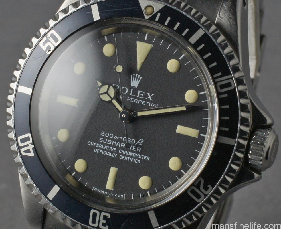
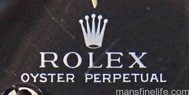
A “Neat Fonts” 5512 dial from 1967 with characteristic domed, light-reactive luminous — Courtesy HQ Milton
Yet another anomaly that comes into play is the luminous material on the “Neat Fonts” dial. Regardless of dial text, the lume is not like the Mark III Red Sub’s with its characteristic flat, textured appearance. But it is like the Mark I meters-first 551x dials in its more domed and smooth shape. Not only that but the luminous on both these “Neat Fonts” and the standard meters-first 551x dials still glows when exposed to light, strongly suggesting that the Tritium compound used on both the standard meters-first 551x dial and the “Neat Fonts” 5512 dial is from the same time period and batch. As far as I’m aware, the lume on the Mark III Red Sub dial doesn’t still glow.
To sum up:
- The 5512 “Neat Fonts” is distinct in terms of fonts, print quality and layout from the standard “first generation” meters-first matte 551x dial.
- There do not appear to be any 5513 dials with the meters-first “Neat Fonts” layout.
- The “Neat Fonts” dial always seems to have been printed with the SCOC text unlike nearly all other 551x dials throughout Rolex history, from the gilt era to the Maxi era, where the dials are interchangeable but the SCOC text was printed on the dial in a second process to make it appropriate for a 5512 Chronometer.
- The “Neat Fonts” 5512 dial is most similar in layout & fonts to the pre-Bart gilt/gloss 551x dials but shares some characteristics with the Mark III Red Sub dial, which has been pinpointed as being produced starting in the 2.1 million range circa 1969.
- However the Tritium luminous of the “Neat Fonts” dial is not like the Mark III Sub but is essentially identical to that found on the standard Mark I meters-first matte 551x dials (i.e. domed and still glows), which were produced from circa 1966-69.
- The examples I have been able to verify all share serial numbers and caseback stamps that date to the earliest era of Rolex matte dial tool watch production, circa 1966-67. I have been unable to establish any 5512 “Neat Fonts” dials in cases later than that narrow window.
So where does that leave us? I’m afraid I haven’t got concrete answers at this juncture and maybe I never will. But it does appear that this unusual Rolex dial, specifically made for their Chronometer no-date Sub, was likely produced in concurrent fashion with what we now regard as the Mark I meters-first matte 551x dial and somehow pre-dates the ref. 1680 Chronometer Sub with date complication. I would think that the fact that both styles of meters-first 551x dials share the same luminous material would be strongly indicative that they also share the same manufacturing period. And we know they are both made by Singer despite their differences. I don’t want to throw out the dreaded word “prototype” that so often pops up when people can’t quite explain something but perhaps the “Neat Fonts” represents Singer’s improving skills at printing matte dials, a secondary but smaller batch of dials using a sightly different method than the initial meters-first matte dials. And maybe Singer went back to their older mid-60s gilt dyes for their printing methods to re-establish a cleaner look for their next generation of matte dials.
It could also be that with the 5512 somewhat making way for the new date model, the 1680, maybe some cases were held over as production of the newer reference ramped up and then actually assembled slightly later than their serial numbers and caseback stamps would seem to indicate. This wouldn’t be unprecedented as we have only to point to the famously out of sequence casebacks of the Mark I and Mark II Double Red Sea-Dweller, which perhaps not coincidentally were produced around this same time. It might also be possible that Rolex commissioned a few last meters-first 5512 dials along with a larger batch of Mark III Red Sub dials, knowing that they would soon be switching to a feet-first format on their dials, and that somehow these dials were produced more like 1968-9 but found their way into slightly older cases. But that last hypothesis is a bit difficult to square with the lume issue. I’ve also heard it posited that this is really an early style of replacement dial and I used to also think this might be a possibility. But that begs the question: replacement for what? Standard meters-first 551x dials were plentiful for many years and then there was the switch to feet-first dials. So why would Rolex need Singer to produce a “replacement” batch of meters-first 5512 dials? And why would all those “replacements” seem to show up in the earliest matte dial days of 1966-67? Frankly, that idea no longer makes sense to me.
Likely the 5512 “Neat Fonts” meters-first matte dial will continue to remain something of a mystery, just like a few other conundrums in the Vintage Rolex world. We’ve made great strides in the collector community over the past 15+ years in deciphering the mysteries of Rolex and many other brands’ hazy, historical glory days of the past. But some things are beyond our abilities to ever get an incontrovertible answer for. For now we can say that the “Neat Fonts” 5512 dial is uncommon, has specific characteristics that set it apart from the standard sequence of production, is found in a seemingly consistent and brief time period and is otherwise hard to explain or justify when Rolex had so many Mark I meters-first matte dials in stock. But then a little mystery is what makes vintage watches in general — and Vintage Rolex in particular — so damn interesting, now isn’t it?
Tom
I am overwhelmed by your generosity and always look forward to hearing your thoughts and perspective on Vintage Rolex. It wasn’t that long ago that collectors were recording serial numbers, classifying dials, and categorizing inserts, laying the ground work for the knowledge that we all enjoy today. It’s good know there are still some mysteries still left unanswered.
I have often wondered about this “neat fonts” 5512 matte dial as well.
I think you are totally correct about the the time frame of these dials based on the serial number range they are found. This is corroborated by the the application of the tritium to the dial that is typical for the mid 1960’s. With every theory I come up with, it helps to have a motive to explain why Rolex would change from the “neat fonts” dial in favor of the more common meters first matte 551X dial. The answer may be cost. By producing the standard more common meters first matte dials in large numbers they could put them in the less expensive and better selling 5513. This also gave them the option of adding the SCOC text later and placing that dial in the 5512. In the long run keeping it simple was probably cheaper than producing two totally different dials for the two references. There is evidence to support this notion. The later silver text applied to the gilt/gloss was likely done for the same reason.
Thank you again for your contribution to the community.
Best Regards
John Field aka Beaumont Miller II
Thank you, my friend!
Again, you really helped me get my head around this oddball dial and cemented some different things I had been thinking, helping them to come together into a coherent essay.
I kind of feel like the mystery part of the Neat Fonts is somehow related to the new date Chronometer Submariner models coming online in the later 60s — Red Sub & DRSD — and that’s what made them print up a few SCOC-only 5512 dials (right before the new models were ready for debut??) and break from their past processes (and then return to that 2-stage printing right away and forever after). But that’s only my gut instinct & only Rolex would know so no way to get a definitive answer on that, I’m afraid.
Anyway really appreciate your insights and hopefully I can pay you back somehow on your next magnum opus!
All the best,
Tom
Thank you for this very interesting article, the first one I ever see about this dials
I see the neat font (neat term btw:) is about white text for these 5512 meter first dials.
How would you consider the family common silver/white (2 lines silver and 2 lines white) text dials that can also be found on early 5512 (I own a nice specimen)
thanks! Alexmo
Hi Alex,
I would say that actually the early meters-first matte dials with the truly silver-looking SCOC text are unusual and not that common (most meters-first matte 5512 have small SCOC text but it is still white). Maybe they are from an early batch and mimic the gilt-era silver SCOC application??
But again, this reinforces my point that it seems that every other non-date 551x Sub dial, gilt or matte, was printed once and then the SCOC was added after as needed for 5512 models. That is where the “Neat Fonts” dial is peculiar, as there is no meters-first 5513 dial with these exact fonts and it seems the “Neat Fonts” was always printed with the (extra wide) SCOC text.
All the best,
Tom